A whistle-stop tour of the new Guardian app
The Guardian's new app for iOS and Android allows users to personalise their homepage and directly submit user-generated content
– 5 min read
The Guardian's new app for iOS and Android allows users to personalise their homepage and directly submit user-generated content
This article was migrated from an old version of our website in 2025. As a result, it might have some low-quality images or non-functioning links - if there's any issues you'd like to see fixed, get in touch with us at info@journalism.co.uk.
The Guardian has today (Thursday, 29 May) launched a new app for iOS and Android devices designed to offer greater functionality for personalisation, interactive pieces and user-generated content.
The free app is an update to the outlet's current iOS and Android apps, which have been downloaded more than 1 million times.
There is also premium option available for £2.49 a month offering daily crosswords and curated content from the Guardian’s archives.
The update is "a ground-up redevelopment of our apps products" for the Guardian's digital products with the aim of creating a more consistent look and feel, explained Tom Grinsted, Guardian group product manager for mobile and devices.
On average our users are using us across three different devices a day - Tom Grinsted, the Guardian
"On average our users are using us across three different devices a day, so it doesn't make a lot of sense for the authorial voice to radically vary between them."
"It makes much more sense for us to be unified and speak with one voice no matter how you visit."
Development on the app began in autumn 2013, and included a beta-testing programme with feedback from more than 5,000 users.
Here are five of its key features.
Whereas the previous Guardian app was "very much a basic list", the redesigned app has a flexible layout which allows editors to curate stories according to their significance.
Content is presented via 'cards' in varying sizes, similar to the format of Facebook's Paper.
The idea, said Grinsted, is to bring back the sort of "intuitive" information imparted when print journalists lay out newspapers, where the layout of the page denotes the most important stories of the day.
In the new Guardian app, all stories have a layer of data, programmed by the newsroom, which controls how and where the story appears in the app.
For example, a more important story will be given a larger card and placed in a more prominent position.
However, these positions can vary depending on the context of the story, so an article which is only of medium importance on the app homepage can still take the top spot in the sports section.
The app also uses "colour language" to guide users through different sorts of content, explained Guardian creative director Alex Breuer.
Whereas the Guardian previously appointed colours to different sections, such as news or sport, the new app marks content by tone or type (blue is used for core news content, orange for comments, charcoal for multimedia and red for live content such as liveblogs).
"On small screen sizes, spaces is at a premium, so [use of colour] is more effective than overloading the app with labelling and typography," Breuer said.
A view of the new Guardian app on iPad
The new Guardian app offers high levels of personalisation. Although the top story on the app homepage is fixed, beyond that the entire homepage is completely configurable.
Users can add or remove sections of the site according to their interests, and can also programme the homepage to just show news from a particular location.
Building on the Guardian's breaking news service, users can also follow their favourite Guardian blogs or contributors, and receive notifications when new content is published.
There is also a new function for users to save articles for reading offline.
The reason the homepage is not fully customisable, with the top story locked in place, said Grinsted, because user-testing revealed "quite an extreme appetite" for a strong authorial voice.
The reason that people come to us is about more than just our copy - Tom Grinsted, the Guardian
"The reason that people come to us is about more than just our copy," he said. "It's about how we put it together and how we curate it so it's intelligible."
Breuer noted there were opportunities in future development to "explore another level of richness" when it came to personalisation and how content might change, not only at different times of day, but also at the weekend.
The recently launched NYT Now app from the New York Times offers personalisation along similar lines, suggesting news summaries early in the day followed by longer reads to users in the evening, when people generally have more free time.
However, Breuer noted that as well as changing the kind of content offered at evenings and weekends to be more lifestyle-orientated, it might also be beneficial to alter the formatting of the app.
"What that demands of a touch-screen device in terms of experience is perhaps slightly different [from web],"he said, "in terms of what takes up the screen, the density of stories, what the interactions are".
For the first time the Guardian app will include interactives, such as maps, charts and liveblogs and content around the forthcoming World Cup.
This is possibly partly because of changes in the way that interactives are rendered in the app, meaning it is able to serve "a whole new level of finesse and interactivity, almost live," explained Breuer.
The development is another sign of the Guardian's more integrated approach to the way content flows across its different platforms.
"Allowing the apps to be able to render interactives really well means that all of the effort that's going into creating a really beautiful, compelling interactive experience on the web will also go through to the apps as well," he said.
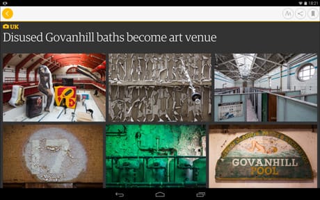
An example of how image galleries will appear in the new app
GuardianWitness – the Guardian's platform for user-generated content – is integrated into the app for the first time, allowing users to upload stories, photos and videos directly into articles where GuardianWitness has been enabled.
"It's the first stop on the app actually becoming a reporting tool as well as a consumption tool," explained Breuer.
"So for our journalists as well as our users, the end goal would be that you contribute [content] and then it appears, so the article becomes much more dynamic."
However, at present there are no plans to fold the GuardianWitness app into the main Guardian app.
"GuardianWitness as an app and as a website is still the place to go to see the totality of everything that's been submitted," said Grinsted.
He added that although the Guardian wanted to bring more of that content back into its central platforms, the outlet was "also quite conscious about wanting to do it in a way which doesn't make any ambiguity between authorial voice and user-generated content".
The new app is supported by integrated advertising, with interstitial ads when users swipe between pages.
It also aims to broaden appeal to advertisers with significantly larger ad formats and MPUs (mid-page units) in-stream for the first time.
This article was updated to attribute a quote to Alex Breuer.