Data visualisation app GetBulb expected to launch this month
The tool for creating maps and graphs works in a web browser and was the winner of The Irish Times digital challenge

– 3 min read
The tool for creating maps and graphs works in a web browser and was the winner of The Irish Times digital challenge

This article was migrated from an old version of our website in 2025. As a result, it might have some low-quality images or non-functioning links - if there's any issues you'd like to see fixed, get in touch with us at info@journalism.co.uk.
New data visualisation tool GetBulb is now being used by a small group of users. The first 100 invitations were sent out last week and the Irish start-up is currently gathering feedback with a planned launch at the end of July.
Working in a web browser, although currently only Chrome, users select the type of visualisation they want to create, drag and drop the template into the work area and then copy data from Excel and paste it on top of the graph or map. A range of different visualisations are available to choose from and GetBulb converts the data instantly.
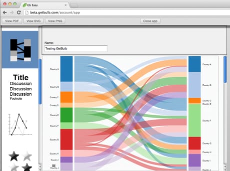
Users can create a series of visualisations with text in between graphs and maps and can save as a PDF, SVG and PNG.
The app is currently free to use with GetBulb planning to monetise by charging occasional users a fee to turn a visualisation into a PDF or other file type. Regular users will be offered subscription packages.
In a blog post announcing the release of the first invites , Oliver Mooney, chief executive and founder of GetBulb, said this is an early version and new elements will be added as the first users provide feedback.
Mooney told Journalism.co.uk that one of the templates currently being worked on is a UK map, so that users can paste data onto the template and see it instantly visualised. Maps are already available for Canada, the US and Ireland and are colour-blindness friendly .
Asked whether users will be able to create an embeddable visualisation, Mooney said they had not received many requests for such a feature and early feedback suggests users do not want GetBulb to host the graphics. Users can instead upload the visualisation as a PDF, PNG or SVG file.
Journalism.co.uk tested GetBulb and found it extremely easy to use with the sample data set provided. There were limitations when we tried to add our own data as some of the current templates only accept rows of data and not columns. Mooney explained that the templates were currently being worked on with new features added daily.
GetBulb was the winner of The Irish Times's digital challenge , a contest which saw the news outlet invite members of the technology industry to pitch projects which could impact on the newsroom. GetBulb was announced as the winner in September and received a €50,000 prize.
Mooney had already been working on the idea for a year when they won the challenge, with initial plans to create a more complex visualisation tool. Advice from an incubator led Mooney to simplify the offering.
He told Journalism.co.uk that got the idea for an easy-to-use data visualisation tool when working as a data scientist at the HEA, Ireland's Higher Eduction Authority. He said he found it "painfully slow" to create data visualisations and wanted to solve that problem and encourage storytelling using data. "You can tell a story much more visually with data than you can with text," he said.
Mooney gave the example of a need to explain the transfer of money between immigrants and emigrants, which is shown in this visualisation ). "That type of visual insight into data that we are trying to accomplish for our users," he added.
To see GetBulb in action watch the four-minute video embedded below.
There used to be something here that couldn't be migrated - please contact us at info@journalism.co.uk if you'd like to see this updated!
GetBulb Intro from GetBulb on Vimeo.