Designing the Express and Star's responsive website
Abigail Edge from the Midland News Association explains how they developed responsive sites for regional titles the Express and Star and Shrophire Star
– 4 min read
Abigail Edge from the Midland News Association explains how they developed responsive sites for regional titles the Express and Star and Shrophire Star
This article was migrated from an old version of our website in 2025. As a result, it might have some low-quality images or non-functioning links - if there's any issues you'd like to see fixed, get in touch with us at info@journalism.co.uk.
The is a guest post by [Abigail Edge](https://twitter.com/abigailedge), a journalist and group online editor at the Midlands News Association, which owns the Express and Star and Shropshire Star.
One of the biggest reasons behind Midland News Association's decision to re-launch its regional newspaper sites using responsive design was the expectation that traffic from mobile and tablet devices would grow significantly.
Another benefit of responsive for smaller companies such as MNA (one of the few independent news publishers still operating in the UK), was that no extra resource would be needed to manage separate mobile sites.
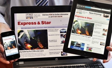
The new Shropshire Star and Express and Star sites, which scale to fit the size of the screen on which they are viewed, went live last summer – ahead of responsive roll-outs at the Guardian and the BBC.
What has surprised a lot of people is that this rather big achievement was accomplished by a dev team of just one developer and one designer/ad-creator led by MNA development manager Mark Cadman.
MNA's forecasts for mobile traffic were borne out by our January figures, which show that 40 per cent of the 1.3 million visits to expressandstar.com and shropshirestar.com came from tablet and mobile devices – up from 25 per cent in January 2012.
Of course, December 2012 was a "tablet Christmas" and it's difficult to determine how much of the upsurge in our mobile traffic is down to responsive redesign, increased ownership of tablets and smartphones, or a little bit of both.
However, one thing which is certain is that MNA (along with many other publishers) will be focusing much more on mobile activity this year.
Key to the success of the MNA's responsive sites is the close working relationship between our newsrooms, commercial and development teams.
A challenge of responsive design – which works on a three-column grid template – is balancing editorial content with advertising to ensure the layout of the site works well across all devices.
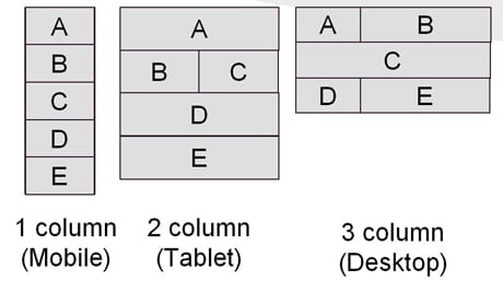
The three-column grid system used for templates
One of the benefits of working within a relatively small company is that avenues of communication are perhaps more accessible than they would be in a larger organisation.
Throughout the responsive design process Mark and I were able to consult with key stakeholders including managing director Phil Inman, the editors of the Express and Star and Shropshire Star, plus MNA's head of digital and digital sales manager to ensure commercial and editorial priorities were all taken into account.
Our web editors also assisted in the creation of webpage templates that would enable them to highlight their best content each day – be it a story, gallery or video.
For example, we have a homepage 'bomb block' that is activated for really big breaking stories (bomb scares, for example), which allows a headline and image to dominate the top half of the site. We also have the self-explanatory 'weekend' template, which focuses much more on features and entertainment content.
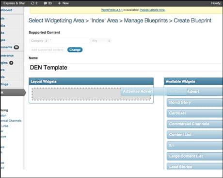
The responsive template builder with our CMS
The only other change to the editorial workflow is that we are now using larger images, which look much better on retina and HiDPI displays.
Because our new sites were mobile-first – we started with wireframes for iPhone and built upwards from that – the commercial experience was an important part of the conversation from the get-go. We migrated away from skyscraper ads, which don't fit easily within a responsive template, and instead increased our MPU selection. Now when we do advertising campaigns we can produce three different sizes of artwork for desktop, tablet and mobile.
Users engage better with ads this way, which in turn means advertisers get a better response – we’ve already seen an increase in tablet and mobile click-through rates.
Content partnerships, which fall under my remit alongside digital editorial strategy, are another element which have been affected by the move to responsive. Any partnerships we enter into must now also be responsive (or at least adaptive) and work across the three most popular mobile operating systems: iOS, Android and Kindle Fire. This hasn't caused us any real problems, but it's worth bearing in mind for any other news sites considering responsive design.
I should add that MNA's responsive development process is still evolving. We expect tablet and mobile visits to constitute 50 per cent of our overall traffic or more by the end of the year, so we're continually looking at ways to better reflect the requirements of our newsrooms and improve the online experience for users and advertisers alike.
