


Credit: By r2hox on Flickr. Some rights reserved
Along with social media and mobile devices, the sheer scale of data now available to inform stories is a major factor in how a modern journalist's role has changed.
Public tools abound in how journalists can more easily structure and visualise data sets, but to the uninitiated, it can all seem a little intimidating.
"Some tools out there are great but they really focus on the beautiful visualisation as the end product," says Catherine D'Ignazio, an assistant professor of data visualisation and civic media at Boston's Emerson College, "and you don't necessarily always know how it got there."
Still more tools for organising, cleaning and understanding data exist, but "my god, it is ugly and it is boring and technical", agrees D'Ignazio's colleague Rahul Bhargava.We really are more focused on the learning process and getting a very simple input, a very simple output and then introducing some of the terminology of why you might want to do thisCatherine D'Ignazio, Emerson College, Boston
So, with recent funding from the Knight Foundation's Prototype Fund, the pair are setting out to make learning about data a more accessible and practical process with DataBasic.
"We're trying to bring some of that fun to the more grimy work and to a set of processes that haven't gotten attention yet," said Bhargava.
Drawing on his experience as a computer scientist and running 'data therapy' workshops, Bhargava is now a research specialist at MIT's Center for Civic Media and has been working with D'Ignazio for "three to four years" on how data can be more approachable for beginners.
"We've really tried to orientate DataBasic to gaps we've seen within the tool landscape that we're looking at right now," said D'Ignazio.
"So, to start with, they're focused on things to do with text mining and text analysis."
With the tools already prototyped, the next six months will be spent developing them into free, public "one-page websites", including versions in other languages and video guides, which anyone can use to get started.
Word Counter
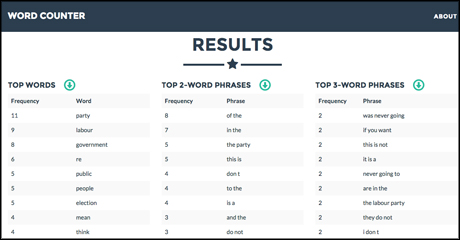
Screenshot of results from running Tony Blair's recent comment piece about Jeremy Corbyn through the Word Counter prototype
Data journalism 101 is about finding patterns and outliers in a data set – the elements that are most common or the rarest.
Staring at a solid bank of 10,000 numbers can be an intimidating start to those more acquainted to words than numbers, but the same thinking can be applied to large amounts of text to find stories.
"For journalists, when they're looking at various kinds of public documents, election speeches, supreme court rulings, state of the union address or whatever, it might be to try to get a sense of the most frequently mentioned words," said D'Ignazio.
Word Counter does just that, finding the most frequently used words and phrases in a document. It may seem simplistic, but the closest most web tools currently come is creating a word cloud – the nonsensical 'mullets of the internet' and the bane of many a data journalist.
Textual analysis can be interesting and informative, but "you get a word cloud back and you're just like 'ok, so what'," said D'Ignazio. The important part for journalists is not in the visualisation, but in understanding the underlying factors.
"We really are more focused on the learning process and getting a very simple input, a very simple output and then introducing some of the terminology of why you might want to do this."
TuffyDuff
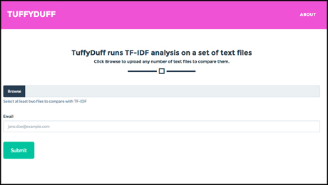
Screenshot of the TuffyDuff prototype
So a word counter is the first step of text analysis, but a deeper level of analysis can be necessary.
Term frequency-inverse document frequency (tf-idf to its friends) is a way of finding how important particular words are in documents or collections of documents. 'TuffyDuff' will simplify and automate the process.
"So the idea is that you could pull in all of Obama's speeches and all of Bush's speeches and all of Clinton's speeches and treat them as three different sets of data," said Bhagarva.
"And what this algorithm lets you do is see which words Obama is using more than you would expect for a president."
The same could be applied to party manifestos, for example, or any other circumstances where journalists may need to find the most important words in a text.
WTFcsv
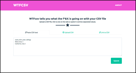
Screenshot of the WTFcsv prototype
"Often when we talk to folks in newsrooms, they get a .csv file from governments or some officials," said Bhargava, "and you just need to figure out what's in there and how to work with it."
The programming language R has a function to summarise large data sets, he said, giving more information about every column in a spreadsheet. But why learn and install a whole code library for one command?
"The very first step of data exploration, when you're given a pile of data, is to say 'let's characterise this'," said D'Ignazio. "Look at maximums, minimums, if there are categories, how many things come into each category, how many are there..."
"So you can understand what you're looking at in each column," added Bhargava, "before you look at all the pivot tables and all the usual things people do."
And it could even help journalists clean data sets, said D'Ignazio, an inevitable process in tidying up a spreadsheet that may have errors, by showing where problems in the data may lie.
A big part of where these projects could expand, she continued, is in the space between a data API (application programming interface) and the general public.
The UK and US governments both have APIs for public data, as do many organisations, but without the knowledge of how to use and access it, the data may as well be in an alien language.
"The API is great, the proliferation of all the APIs is wonderful, but it's making it that one step more accessible for journalists and community organisations," she said.
"There are so many people coming into this space that want to learn how to do stuff, how to work with data, reveal stories and or make arguments with data and that, to us, is the overlooked piece," said Bhagarva.
"There are tons of tools that can help you make a map or make a graph, but learning how to use it well, or appropriately, is the thing that's left out. That's what we're trying to add in."
Free daily newsletter
If you like our news and feature articles, you can sign up to receive our free daily (Mon-Fri) email newsletter (mobile friendly).


