'Space journalism': How ProPublica tells stories using satellites
Knight-Mozilla fellow and 'space journalist' Brian Jacobs explains how ProPublica tells the story of disappearing wetlands in Louisiana using NASA satellites
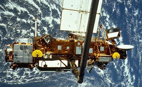
Credit: Image by NASA Goddard Space Flight Center on Flickr. Some rights reserved.
This article was migrated from an old version of our website in 2025. As a result, it might have some low-quality images or non-functioning links - if there's any issues you'd like to see fixed, get in touch with us at info@journalism.co.uk.
Despite the ongoing debate around global warming, rising sea levels are already a dangerous reality in some areas of the world.
In September, ProPublica published its Losing Ground interactive, using satellite imagery to explain the issue of disappearing wetlands in Louisiana.
Speaking at a Hacks/Hackers meeting in London yesterday, Brian Jacobs, a Knight-Mozilla fellow at ProPublica, described how
Losing Ground
combines satellite imagery and maps with photography, audio and text-based reporting.
"It starts with a regional understanding [of the area]...and then it zooms in and you can interact with the timeline above and see how the land has changed," he said.
To illustrate how the wetlands have changed since 1932, Jacobs said he wanted to present the topic "on a more emotional scale" as people "can become numb" to statistics.
ProPublica partnered with The Lens , an investigative news team based in New Orleans, to provide a combination of data visualisation and on the ground reporting.
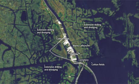
A close-up showing 'farmland replaced by open water' in Leeville (2009). Screenshot from ProPublica.org.
"A big part of this project was the satellite imagery," he said. "These views that we're showing depended heavily on having a picture of today, and showing a clear difference between land and water."
ProPublica's visualisation was created from data obtained freely from NASA, as well as historical maps from Louisiana State University and data from US Geological Survey (USGS).
Using satellite imagery from NASA made it possible for the team to process data in ways other tools like Google Earth, for example, would not allow.
Jacobs said Google Earth gave a cloudless representation of the Earth, which meant the visualisation was in fact "an aggregation of time" as pixels containing clouds were recreated from previous data.
"You get beautiful imagery like this, but then you lose that snapshot of time," he said. "Time was really important for us so we became 'space journalists' and started to process this stuff [NASA satellite imagery]."
Colour processing was a big part of the project, and Jacobs said there were a variety of tools journalists could use for working with the data. He highlighted Photoshop and open-source photo editing programme GIMP as good places to start.
A full list of tools and resources for 'storytelling from space' can be found on GitHub .
Jacobs said working with this type of data was "an approachable thing to do", as he learned all the skills required this year, as part of the Knight-Mozilla fellowship.
The project took around five months to complete, he said, of which two were dedicated to learning how to work with the imagery and how to best visualise it.
But can this visual storytelling work in places where there might be no academic research to fill the gap between historical maps and satellite imagery?
Jacobs said the practical uses of this imagery in journalism would depend on the open data policies of the countries in question.
While satellite data could be obtained globally, he said ProPublica's interactive feature relied partly on a USGS study classifying land over time.
"If a study like that was done in any other part of the world you could do the same visualisation," he said, adding that satellite imagery could also be used in other different ways.
"[And] when it comes to news stories about science, you can do full-blown investigations about the exploits of the oil and gas industry or you can do more explainer pieces," he said.