


Credit: By generated on Flickr. Some rights reserved
With a redesigned website introducing a homepage for the first time, Quartz seems to have doubled back on its proclamation that "the homepage is dead and the social web has won".
But Zach Seward, senior editor at Quartz, says the redesign is more about improving on an existing paradigm, a set of guiding principles inherent from the beginning, and giving readers a broader array of options.
"We're coming up on our two year anniversary next month," Seward told Journalism.co.uk.
"When we launched we had really ambitious goals to grow quickly and knew how we were going to do that" .
"It was useful to have a singular strategy based on the assumption that everyone would come through the side door and every story had to go out and earn its audience out on the social web."
"Ninety per cent" of traffic at Quartz is still coming through the "side door" of social media and other sources, said Seward, a figure that remains central to the publisher's growth plans regarding how readers are expected to behave.
But that still leaves 10 per cent of visitors coming directly to Qz.com, where they would previously land on the latest story.
The parallels between this direct online audience and the recipients of Quartz's popular daily email as a core, engaged readership were apparent enough to try to mimic the newsletter's style as a landing page on the web.
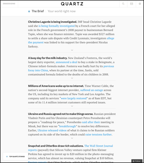
Screenshot of The Brief from Qz.com
"The Brief is essentially a news briefing that you're seeing now," Seward said of the what readers see when they first arrive at Qz.com: the biggest global stories summarised to a paragraph each, full of links to other sites.
"The idea there is can we do something more for those people that do want to come to us directly? Will that encourage more people to do that? And what kind of behaviours might we see in offering this?"
The newsletter goes out to subscribers three times a day, timed to hit inboxes in Asia, the EMEA region and the Americas each morning. Integrating the two publishing schedules to keep The Brief updated with top stories throughout the day makes sense, Seward said, while leaving room to experiment.
As a new site, Quartz has gone from a standing start to almost six million unique visitors a month in under two years and Seward said the redesign follows the same guiding principles that have served them well so far.
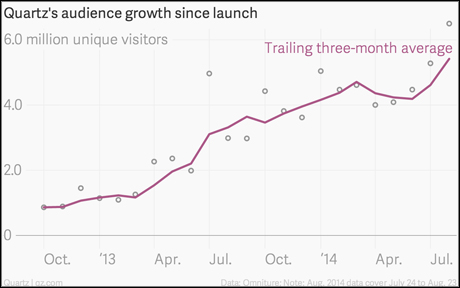
Quartz traffic growth figures. Image courtesy of Quartz.
Stay out of the users' way
"Our initial design – and what we've had for almost two years – has been quite good at not being cluttered, and staying out of the way," Seward said, "but we thought there was room for improvement."
The left-hand navigation bar that previously showed Quartz top stories has been folded into a header bar that disappears when readers scroll down but reappears when readers scroll up.
By removing the excess "clutter", Seward said lets the story be the focus.
Let the stories shine
Despite a slick looking website and redesigns that get the rest of the industry talking, Seward says the focus for journalists is still largely around the quality of the article and presenting it in a manner native to the internet.
"We still say 'assume your story starts with an audience of zero' as it's a really useful way to think how the web works," he said, "but the reality is that stories don't start with an audience of zero now.
"There are plenty of people who are seeking it out directly and The Brief is one way to serve those readers better."
Make sure it works on mobile
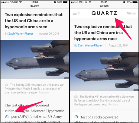
Screenshots from Qz.com on mobile, with the new share button and the folding header bar
Mobile has always been central to how Quartz operates, so the redesign looked to improve on the three principles while "giving the design room to breathe" on mobile.
"What can you do to keep the design spare and streamlined so it looks great on desktops but also is ideal for someone's phone?" said Seward.
The removal of "clutter" for the mobile display means only a floating share button is viewable outside of the article itself while reading, with the header bar returning when the reader swipes up, as on desktop.
"[With] The Brief, the content itself is ideal for when you're on the go and checking in on news," Seward said. "The design is pretty sparse, not trying to do a lot with the design, just being efficient."
But with the new design introducing a homepage, albeit an unconventional one, does this mean the ‘stream’ of articles inherent to the social web is losing its relevance?
"The news site is trying to work well in other people's streams, on Twitter, on Facebook," Seward said, "and that's obviously the simplest way to describe our strategy as well as others.
"But that would fit very really well even if there were a shift towards more consumption of newsletters and a slower web.
"What unifies all of those methods of reading is that they're comprised of links elsewhere and the challenge remains the same.
"There are no tricks here, it's just stories that people want to read and share, which is of course difficult.
"If you can do that then it should translate to Facebook and email and new products that have yet to be unveiled. We don't need to worry so much about that and keep our focus more on quality."
Free daily newsletter
If you like our news and feature articles, you can sign up to receive our free daily (Mon-Fri) email newsletter (mobile friendly).
Related articles
- What AI can do for your newsroom: tips from Ring Publishing's latest handbook
- 200 speakers you need at your next journalism event to avoid all-male panels
- How young leaders can shape the future of the media industry
- Tools, tactics, and success stories of newsroom innovation in 2023
- How news brands can win over young audiences, with Danuta Breguła


