Visual journalism: Advice on building interactives and engaging the audience
Digital storytelling experts outline key factors to consider when producing interactives, including personalisation, user journey and the importance of 'clickability'
Credit: By James Cridland on Flickr. Some rights reserved.
This article was migrated from an old version of our website in 2025. As a result, it might have some low-quality images or non-functioning links - if there's any issues you'd like to see fixed, get in touch with us at info@journalism.co.uk.
Interactive journalism projects can vary significantly in style; indeed the term itself can be used to describe a range of digital storytelling formats, from user interaction features placed within an article, to standalone projects such as data visualisations or gaming interfaces.
News outlets use interactives for a number of reasons: to tell a story in a different, more visual way; to enable the deeper exploration of a large dataset; or maybe to offer greater context or to personalise the issue for the user. But overall, the goal will be to interact with and engage the user.
This feature will outline key pointers shared by a panel of digital storytelling experts on how to build engaging interactives most effectively. The panel includes
Alastair Dant
, lead interactive technologist,
the Guardian
,
Conrad Quilty-Harper
, interactive news editor,
the Telegraph
,
Shannon Perkins
, editor of interactive technology,
Wired.com
,
Martin Jefferies
, chief reporter,
KM Group
and
Dmitry Shishkin
, development editor,
BBC World Service
.
Plan ahead, but also be able to move with the news
At the same time as the interviews for this feature were being carried out (last week), the UK was just days away from the Olympics opening ceremony, providing an array of fantastic examples of interactive features being produced by news outlets across the country in the lead up to the games.
The long lead-in time for coverage of London 2012 was a great opportunity for news outlets to spend time planning and experimenting with new storytelling ideas.
The Guardian's Alastair Dant said "under normal circumstances we don't book ahead too far in advance because we want to be fairly flexible" for the news agenda, but he said for the Olympics "we had to set some time aside a long way in advance."
"That opened a far greater window than normally exists for people to argue the toss about what we should do," he added. "So there was a great deal of to-ing and fro-ing trying to decide what we were going to do.
"I think the nice thing about that is that the ideas that were the strongest were the ones that ultimately persevered."
But as Dant implies there, the years of preparation time is not a regular occurrence and therefore newsrooms need to also be prepared to produce interactive journalism with much less notice.
Wired.com's Shannon Perkins added if newsrooms want to be able to react to real-time news with interactive journalism they need to find ways to "compress that workflow in a way that allows us to bring it into our normal workflow".
We have to begin to think about interactive engagement that can be done in hours instead of weeks - Shannon Perkins, Wired.com
"So we can't be solely focused on interactive engagement that have these production times of three, four, eight weeks. We have to begin to think about interactive engagement that can be done in hours instead of weeks."
The Telegraph's Conrad Quilty-Harper said "a lot of the time when we're working we tend to be working with at least a week lead time", but even so the team has also built in "some capacity" for reacting to a big news event.
"We have some capacity there for getting out a quick reaction graphic and then once we've got that out the way we can spend some more time on really examining the data".
Recognise the power of personalisation
An important point to start with when looking at the content and format of an interactive is personalisation features, a factor highlighted by a number of those interviewed for this guide as a powerful element seen in those interactives which have experienced significant engagement levels and long-tail results.
Dant told Journalism.co.uk that the "increasing emphasis on the ability to share a personalised version of the interactive" is a development which he has experienced in the past year across the industry.
As a result this feature is now "almost a key part of the interactive experiences we plan now".
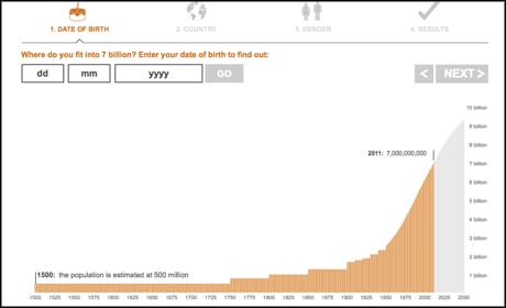
He used the example of a news event last year, when the seven billionth child was born, which prompted a number of interactive features from news outlets which enabled users to input personal information, such as the date they were born, to enable them to plot their place in the population.
Quilty-Harper added that the power of personalisation in interactives "goes hand-in-hand with the rise of social media".
"Following a lot of the US sites like ProPublica they had a lot of success with allowing you to connect with Facebook and see your local schools, and also just in general we know from the stories which we've been working on in the last few years that people really care about data and information that's very relevant to them.
"... We produce an interactive graphic for school league tables as soon as they come out and we know it's going to be extremely popular because we can look over the last few years and see still several thousand pageviews every day for something even if it's six months later as people are coming back as a resource.
"We've always known there's certain types of information people really care about because it's useful to them, but I think the rise of social media and this idea you can get data not just for small different area, you can actually ask for the whole country and then create graphics around that, I think it's become a lot easier so people are able to see with social media, it really blossoming."
BBC World Service's Dmitry Shishkin also cited the impact of personalisation features within interactives, adding that "the more often you put the audience inside the product, the better".
Guide the user
Dant added that when building interactives it is vital that users are provided with "a clear journey through the data or through whatever is in your interactive experience".
[
pull quote (style 1): Having annotation in there, having an editorial slant, having a strong narrative slant, that's pretty important and so I would definitely look for that:::Alastair Dant, the Guardian
]"You've got to try and avoid overwhelming people because I think certainly with data visualisation you could put an awful lot of stuff in front of people at once, particularly if you put all that stuff in front of them without any kind of clear sense of what the conclusions to draw are.
"Having annotation in there, having an editorial slant, having a strong narrative slant, that's pretty important and so I would definitely look for that."
The KM Group's Martin Jefferies added that clear instructions on what a user needs to do with the interactive can also be helpful.
"This might be completely new to someone who's just used to reading a news story on a website and maybe looking at a couple of pictures. You need to tell them what they've got to click on".
Ensure "talkability" and "clickability"
Jefferies added that another key ingredient for success with interactive forms of journalism is "talkability" and "clickability".
Interactives need to "have quite a bit of depth", he said, with the ability for users to explore the data. And he added that there also needs to be a conversation around the story, or as he described it, "talkability".
"People need to be discussing the story on the social networks, on Twitter, on Facebook, it needs to be generating that social content really."
Promote on other channels
And news outlets can also add to the conversation by getting word out as much as possible about the interactive work, using other channels and platforms available to promote new features.
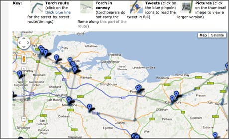
Jefferies explained how the KM Group "heavily promoted" its recent \#torchreporter experiment , which saw users invited to tweet Olympic torch relay pictures and video, along with their location postcode, which were then brought together and mapped them on KentOnline.
The KM Group used its network on kmfm radio stations, newspapers and local websites to promote the project.
"We were promoting that on air, online and in the papers for three or four weeks before and if you look at the response we got 200 tweets or so in the four days. That was great but without that pre-promotion it probably wouldn't have been anywhere near that."
Remember the visuals
But news outlets need to keep visuals at the forefront of their minds. Without the powerful visual you cannot emotionally engage the user, Perkins stressed.
"It's just disproportionate how much a part of the experience that visual element is, what those elements the user is going to interact with, what they look like.
It's the visual style, the visual treatment of the piece that engages the user and keeps them and makes them want to go tell their friends about it because it looked cool and it felt cool to them emotionally - Shannon Perkins, Wired.com
"Our emotions are so driven by those colours, by those images.
"... You're trying to represent the operations of a system, you're trying to deepen the user's understanding of the operation of that system. But you know what, you cannot get there if you do not engage them initially emotionally. And it's the visual style, the visual treatment of the piece that engages the user and keeps them and makes them want to go tell their friends about it because it looked cool and it felt cool to them emotionally.
"So it has to come first, without that emotional hook you're never going to get to the learning which is really the heart of it."
Do it for a reason
BBC World Service's Dmitry Shishkin highlighted the importance in making sure interactives work is done "for a reason". This is something he tries to ensure within the broadcaster's language service as demand for such journalism grows internally within the World Service.
In fact he said they are now considering boosting the specials team, which produces this work and currently includes two full-time editorial people, one designer and client-side developer for 27 languages, as a result. Therefore it is key to make sure the team is doing "interactive stuff for a reason".
"It needs to have a very strong editorial focus, and as
[Bella [Hurrell] said during the presentation at the news:rewired conference](http://www.newsrewired.com/2012/07/20/presentations-data-to-story-ideas-in-data-journalism/)
, it needs to help to tell you the story".
For Shishkin this means often concentrating on "big things" in order to "make an impact".
Jefferies also added that in order for the regional news team to do an interactive "really it needs to add something to the story".
"If it can be told in words and pictures perhaps better than it can in an interactive map or interactive graphic then there's really no point in us spending a day or two creating an interactive that's going to be really secondary to that main story."
Encourage journalists to be involved
At the BBC World Service the specials team projects are a collaboration between editorial, development and design staff, and the involvement of journalists in the building of interactive projects is very important Shishkin adds.
It absolutely is vital that journalists take part in the construction of the interactive specials right from the start - Dmitry Shishkin, BBC World Service
"It absolutely is vital that journalists take part in the construction of the interactive specials right from the start. What I am saying to them all the time when they come pitching their stories, 'forget about how it will look, only think about what will be inside from the content view, just think about what kind of message you want to convey and then the designers will take care of other things'."
But he said he is still fighting the attitude of "I'm not technical" from some journalists. "I think this is something which is really a legacy thing of the past ... I actually don't believe that at all."
Jefferies spoke about the importance of giving the newsroom "time to prepare", and to encourage journalists to equip themselves with the basics when it comes to web code.
"I think it's pretty difficult to imagine a web journalist now posting to a news website like KentOnline without having some basic html or CSS skills. I'm proficient in both of those but I've had to learn a bit of Javascript, a bit of Python and PHP in the last couple of months."
Ways to measure success of an interactive
Once you have considered all the above pointers for planning and production, how can you measure the success of the final interactive?
- Social sharing
Perkins said in recent years social sharing "has probably become our main metric, so we look at that really heavily". The Guardian recently took the social sharing of one of its interactives a step further with its recent 'Could you be a medallist?' feature , by offering extra features for those who used the title's Facebook app.
- Engagement on the page
Put simply, Dant said that "when an interactive works you'll generally find people are on the page far, far longer", if only due to the fact that the "amount of information they've got access to is just far richer".
Perkins added that it is also not just about the short-term gains for pageviews, but that these forms of storytelling offer long-tail engagement too.
"Especially in journalism, you look at all this content we put out on a daily level, if you're lucky it spikes for a few hours and some really great pieces that a journalist really spends some time on writing we can maybe even leave that on the front page promoting that on the front page for a couple of days and we'll get a few days of life out of it.
"... What we've noticed with these other engagements, like the Somali pirate game [published three years ago], it is still tracking in the top 100 of our articles. So while sometimes they don't track at the very top of some of our better written pieces, but they have this life span that seems to go on for months, and in the case of the Somali pirates game really it's gone on for years now in terms of continuing to attract clicks and pageviews."
Interestingly though, Jefferies said this was not usually the experience at the KM Group, and that "the standalone story with the words and pictures would normally get more [traction] than an interactive page would do".
"For us it's a great way of adding a bit more multimedia and a bit more interactivity to the pages and get the readers to interact with us a bit more."
But increased time on the page seemed to be a recurring theme with the national publishers. Quilty-Harper used the example of recent coverage of Premier League finances by the Telegraph's sports department to illustrate this.
"We put that up as an interactive graphic and that actually ended up doing about 50 per cent more traffic than the story itself online. So people were exploring the data and their club and their information that related to them more than they were reading the actual story about it, so that's the real potential for this kind of stuff."
- Greater impact of stories
Quilty-Harper also spoke of the greater impact a story can have when presented as an interactive that enables users to explore deep data, using a story from 18 months ago on council credit card expenses to illustrate this.
"We did a relatively interactive feature online where you could actually see the 180 councils where we'd FOI'd their expenses and you could actually go in and poke around yourself.
"The reaction of that, by putting that online in an interactive way so that people could search and explore, was that you had the newspaper splash on the Saturday and by the Monday you had councillors in a dozen councils being questioned in their county halls about this story - and that was partially because the data we put online in an interactive way that is searchable and that possibly wouldn't have happened in a traditional newspaper story, where you just write the top 10 and you don't reveal the whole data and you don't allow people to explore it."
Size does not have to matter
There are a number of tools available to help any journalist produce basic-level interactive graphics, no matter what the size of the news operation.
Quilty-Harper recommended Google Fusion tables as a "free, easy to get your head around tool".
"So you're able to take a map based on boundaries and also put points over the top of it and very easily do that in a generator tool. I'd say that's probably the best starting block."
He added that using Google Fusion tables users can also create personalised interactives, by creating "a chart that has a box that has a selector or search term and gives you a different bit of data".
"That's not something that requires a lot of knowledge. But it's when you want to do custom styles and link it up to other bits of data or make sure it's compatible across all browsers and all this kind of stuff. That's when you start needing professionals and designers and front-end developers to get involved."
"If you can work at the level of web development and can work with our Miso libraries then you've got the greatest possible degree of authorial freedom, you can basically combine the components together in whatever form you want," Dant explained.
"If you're working with templates you can still customise an author but you've got the template as a starting point, so you'll never go that far away from how the template was to begin within.
"And then finally with the 'visualise this' button or something equivalent for timelines or slideshows or anything of that nature, you're going to be getting a far more regimented output and you'll have a few parameters but you'll never have any more freedom beyond that."
And Perkins also talked about the ability for news outlets, if they wish, to focus on smaller pieces of interactive journalism that may not be standalone, such as the integration of QR codes around content.
If inside a smaller operation you have a digital leadership who actually get it and understand the importance of that, I think that the world is your oyster - Dmitry Shishkin, BBC World Service
"All that is is being resourceful in your thinking and basic html and CSS. Part of the problem is purely perceptual. The idea of what interactivity is to a large degree has been informed honestly by our experience with video games, and video games have huge production values and so we're used to thinking of interactive engagement in a way that is similar to that and I think we need to break out of that thinking and we have to begin to think of these very small, discrete, light little things we can do that are still meaningful."
And if you are part of a smaller scale operation, Shishkin says there is an advantage to be enjoyed when it comes to digital storytelling experimentation, with smaller organisations or teams able to "be much more creative when it comes to interactives".
"Obviously myself working for the BBC, a public organisation, I need to be dealing with things like we can't be using a particular service for fair trading reasons, for example, so we have an ongoing issue with mapping systems, for example, because we can't really rely on Google earmarking all of our content with their logo.
"...Obviously if inside a smaller operation you have a digital leadership who actually get it and understand the importance of that. I think that the world is your oyster."