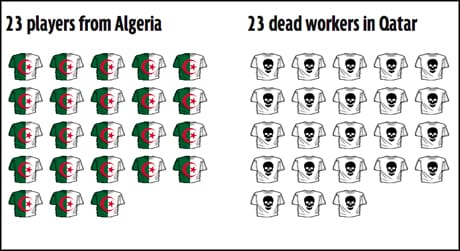
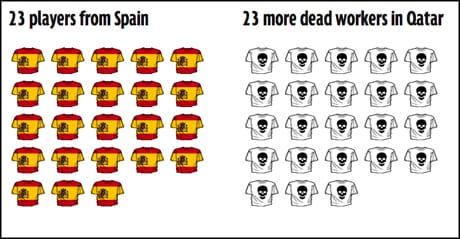
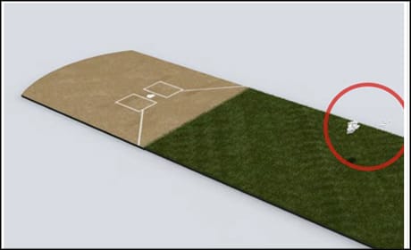
Spotlights
Credit: By huangjiahui on Flickr. Some rights reserved.

The world of visual journalism tends to revolve around three ideas: pictures, video and data visualisation. The web can give many more options, however, and telling a visual story can take on a number of forms.

Journalists are well-versed in understanding the grammar of prose in telling stories with words but, when it comes to visual storytelling, journalists need to understand "visual grammar", according to digital storyteller Adam Westbrook, speaking to the Digital Editors Network's VisualDEN event yesterday via video link.

Tell me and I'll forget, show me and I may remember, involve me and I'll understandChinese proverb, cited by designer Lulu Pinney at VisualDEN
"If the web is a more visual platform, and storytelling is getting more visual, then we better have a good understanding of what visual storytelling is at its most fundamental level," Westbrook said.

Central to the idea of visual storytelling is the idea of juxtaposition, combining two images that create a third idea in the mind of a reader, he said. As an example, he cited a recent story from Ampp3d about worker deaths in Qatar.

According to a report from the International Trade Union Confederation, 1,200 people have died constructing venues for the 2022 World Cup. Rather than choose quotes from the report or write a text article, Ampp3d visualised the number of deaths by comparing them to the squad announcements for the World Cup teams, which had been announced the same week.

Each 23-man squad was depicted in their team colours, next to a representation of 23 worker deaths.

ampp3d 1
Screenshot from Ampp3d

This visualisation went on for the full 32 teams. One image alone wouldn't have told the story as well, said Westbrook, but the continuing juxtaposition made the story "much more powerful".

ampp3d 2
Screenshot from Ampp3d

Although juxtaposition is more easily applied in "sequential" media forms, like the constantly scrolling list of deaths in the Ampp3d story, Westbrook said, that does not mean non-sequential media forms cannot use juxtaposition to tell a story.

Indeed, some of the most famous examples of photojournalism posit two ideas or images against each other in one frame.


Westbrook also pointed to two apps which can help journalists to easily tell visual stories, practising the idea of visual juxtaposition. Twitter's six-second video platform Vine was the first, as it allows users to easily cut between different images when recording.

He also recommended GoPop, in which users upload or record two images or videos that a viewer can alternate between by tapping the screen. Although optimised for mobile and often used for more light-hearted or trivial uses, the app is effective in conveying the idea of juxtaposition and can be used for more news stories, like this example of how the Shanghai skyline has changed in 20 years.

There are some key tenets which any kind of visual storytelling should embody though, said Lulu Pinney, giving her perspective on visual storytelling from a  designer's perspective.
Pinney was keen to stress that, while data visualisation is important in telling stories with numbers, it had in many ways "eclipsed" traditional forms of visual journalism.

Referencing a Chinese proverb – "tell me and I'll forget; show me and I may remember; involve me and I'll understand" – she gave three examples of where news organisations had created effective visualisations away from data.

Pinney described the first as an "interactive print graphic" from a Swedish news outlet Dagens Nyheter comparing the relative attributes of leading football goalkeepers in the country.

goalkeepers hands
Screenshot from LuLuPinney.co.uk

Showing life-size pictures of goalkeepers' hands helped readers to get a a real idea and understanding of the story, said Pinney, allowing them to compare with their own.

The second example came from the Washington Post, published during the search for Malaysian Airlines flight MH370. Authorities were initially searching for the missing aeroplane in an area of 120,000 square square nautical miles, but new information shifted the search to cover more than than 2.24 million square nautical miles.

Such a large number is difficult to put into perspective in relation to the size of the aircraft, even when it is shown on a map, so the Post created an interactive graphic to help readers understand the scale and difficulty of the search.

wapop mh370
Screenshot from WashingtonPost.com. Each tiny dot represent one square nautical mile.

The graphic represented the search area and asked readers to zoom down to the size of the plane by clicking through, taking more than 20 clicks before the plane begins to appear as a dot on the screen.

The final example revolved around an animated video detailing the success of baseball player Mariano Rivera, and why his pitches are so effective.

The video went into detail around how Rivera's throwing style was unpredictable for batters, with voiceovers from players who had played with Rivera, but the animation helped viewers understand why it was so effective.

nyt rivera

Of the 1,300 pitches thrown by Rivera in the 2009 season, the majority were all in the same area at the point when a batter must make a decision about how he thinks the ball must be hit. Because of Rivera's style however, it is very difficult to predict which direction the ball will spin by the time it reaches him.

The video was effective in involving the reader by giving them the perspective of the batter, Pinney said, and showing the variety by which the pitches can vary, despite starting in the same place, and why that makes Rivera an effective and successful pitcher.

For journalists to learn and understand visual journalism, Pinney recommended building a library of references to draw inspiration from, and to look regularly look at how other designers or organisations convey ideas in a visual form.

Pinney has her own collection available on her website, which she shared with delegates.

Free daily newsletter

If you like our news and feature articles, you can sign up to receive our free daily (Mon-Fri) email newsletter (mobile friendly).