BBC News rolls out responsive site to mobile
BBC News develops mobile experience as one third of viewers access the website on a phone

– 1 min read
BBC News develops mobile experience as one third of viewers access the website on a phone
This article was migrated from an old version of our website in 2025. As a result, it might have some low-quality images or non-functioning links - if there's any issues you'd like to see fixed, get in touch with us at info@journalism.co.uk.
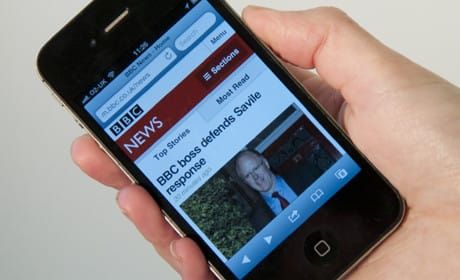
BBC News has begun rolling out its new responsive site as the default option for mobile phones.
From this week anyone accessing the BBC News website on a phone will see the new mobile site rather than the desktop site, designed for larger screens.
Responsive sites detect the device a website is being read on and adapt the view to suit the screen size. In this case articles are displayed in a single column.
The responsive site was announced in March and since then new features have been added, including local news, local weather and making video clips available to iPhone and Android users.
The new site improves the user's experience, Steve Herrmann, editor of the BBC News website said in a blog post, as it "can be awkward to pinch, zoom and scan the stories on a small mobile screen" when using a a desktop site on mobile, Hermmann writes.
He adds that the team is carrying out "similar work to optimise the site for tablet users too".
The post continues: "The number of people coming to BBC News on mobile continues to grow. In an average week, 13.3 million users worldwide use their mobile or tablet to visit the BBC News site and apps - around one third of total users to BBC News Online."
Earlier this month Journalism.co.uk reported on the "big launch" of the BBC News responsive site when it was discussed at the AOP Summit .
Yesterday Time.com announced its shift to responsive design . Other news sites, including Channel 4 News , have made the move to respnsive design and last week the Guardian unveiled its responsive site which it said is a "work-in-progress" .