Guardian unveils 'work-in-progress' responsive beta site
The Guardian has unveiled a beta version of its responsive site project, but emphasised it is a 'work-in-progress'
– 2 min read
The Guardian has unveiled a beta version of its responsive site project, but emphasised it is a 'work-in-progress'
This article was migrated from an old version of our website in 2025. As a result, it might have some low-quality images or non-functioning links - if there's any issues you'd like to see fixed, get in touch with us at info@journalism.co.uk.
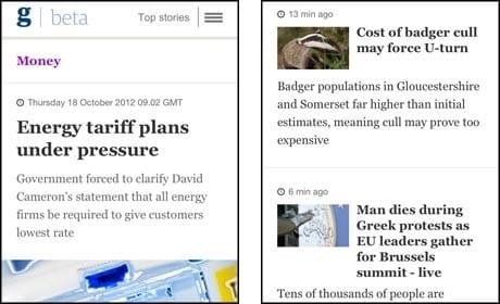
The Guardian today invited public viewing of its beta responsive website project, although the news outlet emphasised that it is a "work-in-progress" and "still in its early stages".
Currently the Guardian advises that users view the responsive site on mobile devices for now, "as this is our design starting point". In a blog post outlining the beta site , client side web developer Matt Andrews said "the responsive aspect of the project is still fairly brief".
"Our initial goal is simply to update the Guardian's current mobile website," he said. "Eventually we aim to scale up to handle resolutions up to desktop width, but this goal is a while away yet.
"With that in mind, the site currently feels a little unwieldy when viewed at large resolutions, but we expect this to evolve gradually as the project continues.
"There are a few nods to the responsive concept, though – watch as 'trail text' appears underneath related content headlines as the device width increases (or you resize your browser)."
He added that for developers the benefits are "clear".
"We can avoid the headache of re-implementing features and concepts across multiple platforms multiple times, and streamline our release process to allow us to push updates and enhancements out to several of these platforms simultaneously."
And the user will also benefit from "the experience of browsing a webpage which is tailored for their particular viewing context, rather than attempting a one-size-fits-all approach which either forces everybody into a lowest common denominator pigeon hole, or assumes a high bar of entry which not all visitors can match."
While the beta site went public today, development is ongoing and Andrews explains that it just "represents a snapshot of where the project is at the current time".
The Guardian also plans to "share more about our code, what we've learned, and what we're planning" in time, he said.
Andy Hume, a
front-end software architect at the Guardian, talked about the move to responsi
ve design at a recent meet up of Hacks/Hackers Brighton. For details see this blog post by Adam Tinworth .
At the AOP Summit last week, it was revealed that BBC News was planning a "big launch" in its move to responsive web design this week, with readers accessing the site on a mobile to be redirected to the responsive version of the site rather than the desktop version. Channel 4 launched its responsively designed website in August which, the broadcaster explained at the time, means the website will "automatically reorganise its content for optimum viewing on any platform, from mobile to tablet to a resized browser window".