How Quartz redesigned its homepage to showcase different storytelling formats
The outlet's new landing page features pieces in a variety of formats, including bold visuals, charts and video
– 4 min read
The outlet's new landing page features pieces in a variety of formats, including bold visuals, charts and video
This article was migrated from an old version of our website in 2025. As a result, it might have some low-quality images or non-functioning links - if there's any issues you'd like to see fixed, get in touch with us at info@journalism.co.uk.
Quartz, the brand that defines itself as a "news outlet for the new global economy", unveiled a new homepage two weeks ago, a little over a year since the initial concept that replicated the organisation's newsletter was first introduced.
The three year-old outlet's homepage redesign comes as a bid to better showcase the different news formats Quartz now works with, including charts, podcasts and video.
The second version of the homepage has been in the making for three to four months, Quartz designer Daniel Lee, who lead the project, told Journalism.co.uk.
The company is known for its 'ever-evolving' approach to design , which consists of gradual updates to the website as and when new digital trends emerge, rather than numerous changes introduced all at once.
"We wanted to have a landing page for people who weren't necessarily familiar with Quartz, a destination to show them what our brand is all about," Lee said.
When there is editorial curation involved, homepages can really be a reflection of the individual editor - Heather Landy, Quartz
The previous version of the homepage featured one bigger story at the top, followed by The Brief, a list showing the outlet's most popular stories summarised in a paragraph each, and a further stack of headlines.
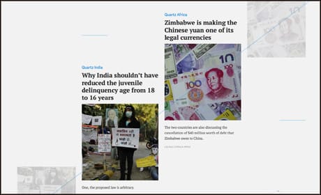
Under the current model, Quartz aims to give more recognition to its news coverage that goes beyond written articles, including shareable charts made with its Atlas platform , short videos and strong images.
The element dominating qz.com under the new design is a black and white Q letter on the left hand-side, which acts as a subtle masking for a photograph that is unveiled on a full screen when readers hover over the top story's headline.
"The main decision to make under the old homepage model was really just what goes into the top slot", explained Heather Landy, global news editor at Quartz.
"We would look for pieces that had great images to go with them, because the image was so front and centre, and we also wanted really strong headlines.
"These were stories that were either more distinctive or a huge breaking news story, where we just had to lead with our own take on it."
Under the new homepage, editors have more freedom to curate the different sections, under a daily schedule divided in morning, afternoon and early evening shifts, "with an understanding that if anything pops up in the interim or a big breaking news story happens between these time frames, it can be slotted in".
Because the current approach is still in its early days, only one person at a time can make changes to the homepage, although this is likely to change in the near future to allow simultaneous curation.
The editors eligible to manage the Quartz homepage come from all the different areas of the newsroom, from the breaking news desk to the opinion section, she explained.
"I like the idea of having it diffused like this, because when there is editorial curation involved, homepages can really be a reflection of the individual editor and each person brings something different to the process.
"A tech editor might curate the homepage one day, a finance editor another, and that might put a little bit of a spin on it each day that, I think, can actually be really healthy and really interesting to a reader."
Tweet content
— User View on Twitter
The curation process is the same for Quartz India and Quartz Africa, which readers in those respective locations get by default, and the stories featured on the main homepage from the two global editions are populated automatically on qz.com.
Similarly to many other news organisations, the majority of Quartz's traffic comes "through the side door", with roughly 90 per cent of readers landing on the website from social media platforms, shares and email.
In a post announcing the redesign , Zach Seward, Quartz’s vice president and executive editor, said the new homepage is a suitable "welcome mat" for the outlet in 2016, after having spent the last twelve months focused on expanding its audience.
Landy explained: "What really mattered was the story page people landed on when they came to us, and then maybe one or two stories after that in the infinite scroll."
So while the outlet is not necessarily trying to get readers to go back to the homepage after they've read a story, much of the focus is on further recommending articles that will grab their attention before they close the tab or the mobile browser window.
If a person accesses a Quartz story from Twitter, they'll be shown an excerpt of the story, followed by a 'read full story' button and a list of suggestions for what to read next at the end of the article.
On mobile, readers also have a choice of four buttons at the bottom of the screen – Home, Our Picks, Popular and Obsessions – which they can use to filter stories or delve deeper into a particular category.
Landy said that occasionally, if editors feel they have a "strongly related story" that would be relevant to the audience, "you might see us put a note in the story people landed on that says 'read this next'".
"In terms of our editorial mission, [the new homepage] sits in nicely with where I think we can be most influential.
"It's a great way to feature both our really distinctive pieces and the stories that we write when we see something breaking, or when we notice a trend and want to just jump in quickly.
"There are now more choices to showcase stories on both of those levels than we had before," said Landy.