Why The Global Mail has focused in on data and investigations
The not-for-profit investigative outlet launched data visualisation Behind the Wire today, as part of a new focus on data and 'more editorially ambitious' stories
Credit: By Mark Hunter/ toolstop on Flickr. Some rights reserved .
This article was migrated from an old version of our website in 2025. As a result, it might have some low-quality images or non-functioning links - if there's any issues you'd like to see fixed, get in touch with us at info@journalism.co.uk.
Late last year The Global Mail, a not-for-profit news organisation in Australia funded by donations, carried out a redesign of its website. At the time, chief executive Jane Nicholls spoke about future plans for the organisation, which included more data visualisations. And in the months since, The Global Mail has done exactly that, realigning its focus to include more data journalism and in-depth investigations.
Speaking to Journalism.co.uk last week, editor Lauren Martin said following the redesign the Mail "took a good hard look at the environment in which we were operating", and in light of its funding model, "adjusted our focus to figure out how we could make the most of philanthropic funds".
The new approach
The idea is to avoid "replicating what other people are doing very well", she said, and instead use its funding to ensure its stories "have impact". The team at The Global Mail "want to do independent journalism, really create a space for fact-based storytelling and innovation in the digital medium to make really important issues engaging", she added.
Martin said that compared to the first 12 months of the organisation, during which time it published "more than 500 stories", the organisation has now made a "conscious decision" to produce "a much smaller number, but each one of them more editorially ambitious."
This adjustment has seen The Global Mail becoming an outlet with "more in common with a production company, or a publishing house, than it does with a news site," Martin said.
Deputy editor Sam Bungey added that now it works on acting as a "facilitator" which can "bring together the best possible people for a chosen project".
Lots of the stories The Global Mail is working on are "the kind of stories that one person can't really tell, or could be told so much better online with a group, bringing in data journalism, investigative reporting, graphics," he said. "And bringing that all together is really when we're able to do the best work that we we've done so far."
As such the outlet is "trying wherever possible to look for partnerships", whether it is to help with "pooling resources" for production purposes, or helping to share the end products with the world. Recent partnerships have included collaborations with SBS Dateline, Time.com and the Guardian in the UK.
And today, The Global Mail published the latest result of a collaboration, this time with a trio of young journalists with a whole lot of data to digest.
The latest project: Behind The Wire
The new data project, Behind The Wire , is based on the result of Freedom of Information requests, covering records of 'incidents' involving those in asylum detention centres in Australia.
The Global Mail was approached by three young journalists with "this cache of documents", totalling more than 7,000 individual reports.
The subject of asylum, in particular cases of asylum seekers who come to Australia by boat, is a "high-profile and often divisive issue in Australia," Martin said, and as such can be a "challenge for any journalist covering it".
Bungey added that the aim of Behind The Wire was to "zoom out of the issue and see it again".
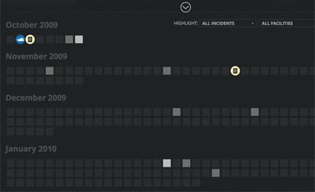
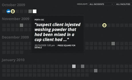
The visualisation presents each incident report as a dark square, organised by date. Users of the visualisation can hover over each square to see a snippet of the report, or click on it to find out what other detail is available. In some cases a circle is instead used to denote a "related event" such as links to media reports on relevant news stories.
And this is a visualisation which will evolve and grow in meaning over time, as it gives its users the ability to lighten the shade of a square by 'flagging' it up as a particularly significant incident.
The end result is "like a monument to life in detention centres," Bungey said.
"It's an overwhelming experience once you get in there," he added, highlighting the contrast in reports from the more "mundane" reports, to extreme cases, such as suicide attempts or hunger strikes.
And due to the interactive nature of the visualisation, this experience will continue to evolve.
'The audience is going to finish the job'
While the data presented in the visualisation offers the report summaries, this is just "one layer", Martin explains. "Behind them the immigration department holds more detailed reports."
Some of these are already available, but not all, and so another element of this visualisation is to encourage users to engage in getting those details released through further FOI requests.
"So the idea was, if people are exploring this and interested, to give them an outlet to crowdsource the FOI requests to get more detailed reports," Martin explained.
Bungey said this is "a very simple process", and The Global Mail is working with DetentionLogs.com.au and RightToKnow.org.au to help get the FOI requests sent off and monitored.
"It's a three click process to getting the incident flagged and then getting the FOI," Bungey added. The details will then be stored on Detention Logs , the site run by the students who came to The Global Mail with the original data.
As well as the visualisation, The Global Mail is doing its own coverage of some of the individual stories being uncovered in the data. And Martin added that they are "keen for anyone to use [the visualisation] to delve in and investigate".
Behind the Wire also offers the ability for people to embed a widget on their own blog, with a changeable headline, highlighting reports they wish to flag and linking back to the visualisation.
So overall, the feature provides a "number of layers", Martin said.
Meeting the data challenge
Figuring out the best approach to presenting more than 7,000 incident reports is a challenge, but the news outlet was clear from the start that it wanted to do so in a way which would give a complete picture, rather than an edited perspective.
"It's the seeing the totality of the thing, the mundane mixed with the awful, is the really compelling thing at the end," Bungey said. It is this "juxtaposition that makes it so strong", he added.
However, to help users digest the data, the visualisation does allow people to filter the squares by facility or type of incident.
There is also a tour of the visualisation, which each user is presented with when arriving on the visualisation page for the first time, to help ensure they get the most out of the feature.
Martin said this was something the team "wrestled with", due to wanting to protect the "impact of the look of it".
"But with user testing we realised it is one where it's intuitive once you have a few clues," she said. Therefore the run-through is "your only option" when first opening the visualisation.
From then on the tour is still available, but the user is free to dive into the data.
"People do really love it when they get into it," Martin said, adding that she is hopeful that "the organic nature of it will mean that it gets brighter and more interesting and shared."
Making a success of audience participation
Part of the evolution of Behind The Wire will rely on users actively engaging with the data, both in terms of flagging certain reports and pursuing FOI requests.
Bungey said while there have been similar attempts by other news outlets to get the audience involved in looking through data, he has not previously seen a visualisation which "actually changes" based on users' inputs, and gives the ability for them to actually contribute "graphical evidence".
Martin referred to a previous project by The Global Mail, PartyLines , which "allows a user to search any key terms that have been used in the Australian parliament back to 2006".
This project, which has made the shortlist in the Data Journalism Awards , still has stories emerging from it, Bungey said, and this is something he hopes to see happen with Behind The Wire too.