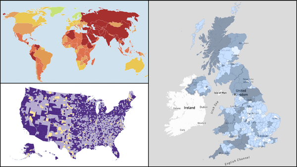
The one question The Times is answering through data
A new data team uses simple charts and colour-coded trends across 40 indicators to help readers make sense of the numbers

– 2 min read


A new data team uses simple charts and colour-coded trends across 40 indicators to help readers make sense of the numbers
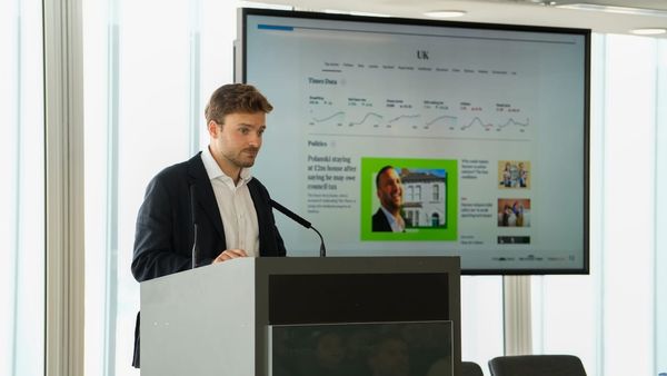
There's often a striking mismatch between what official statistics say and how people feel about life in Britain. As Tom Calver, data editor at The Times and The Sunday Times, put it at Newsrewired (14 May 2026): wages might be rising, but people don’t feel better off. Crime rates may be falling, yet streets seem more dangerous than ever.
For Calver, this disconnect isn't because people are bad at interpreting numbers — it’s because the right data isn’t always available or accessible in a way that resonates with public experience.
His solution? Calver leads the Times Data team, a new section designed to give readers a clear, regularly updated snapshot of the UK’s health, migration, and economy. It aims to empower readers to answer the single question: "Is Britain getting better or worse?" using transparent, consistent, and easily digestible information, built on three core principles: