9 free mapping tools and resources for visual storytelling
Use maps as a storytelling tool to explain context around a breaking news event and create an immersive experience for your audience
– 6 min read
Use maps as a storytelling tool to explain context around a breaking news event and create an immersive experience for your audience
This article was migrated from an old version of our website in 2025. As a result, it might have some low-quality images or non-functioning links - if there's any issues you'd like to see fixed, get in touch with us at info@journalism.co.uk.
The resources available for working with data and visualising it have become more numerous and more accessible in recent years.
"We find ourselves in this perfect storm where suddenly journalists, everybody, is paying attention to data and the ability to collect data and create new data," Vizzuality's Andrew Hill told Journalism.co.uk earlier this year.
Vizzuality created open source mapping tool CartoDB , and the team also set up " the map academy " where journalists can access free resources to learn more about online mapping.
Mapping can be a powerful storytelling tool, which journalists can use to take their audience on a journey following a narrative storyline, or to illustrate and make sense of fast moving breaking news events.
Here is a list of 11 mapping tools reporters can use to add an extra dimension to their reporting and to build a more immersive experience for readers.
All tools featured below can be used for free, although some are supported by a freemium model where additional options are available on a subscriber-only basis.
The free version of Vizzuality's CartoDB supports most data tools a reporter would need to create a map, including the ability to work with CSV and Excel spreadsheets as well as allowing data imports from Google Drive and Dropbox.
There is no limit on the number of data tables you can work with for free with CartoDB, but they will be publicly accessible until a subscription is purchased.
Maps created with the free version of CartoDB update in real-time, keeping up with the changes in the data table they are based on. They can also be animated or customised with CSS.
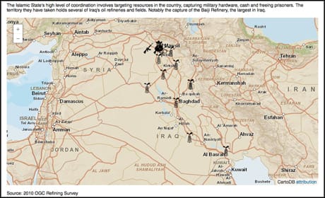
Screenshot: Map: Rebels' path through Iraq, Al Jazeera using CartoDB
BatchGeo lets you copy and paste location data into a map generator, and then builds a Google Map with the appropriate markers for you.
Markers can be grouped together by category to highlight connections between locations or events.
BatchGeo is also available as a mobile app, enabling reporters to create maps on the go.
It has a native app for iOS that works on the iPhone and iPad, and also works on Android devices or Blackberry smartphones and Windows Phone.
ZeeMaps works in a similar way to BatchGeo in that you can copy paste location data to generate a map, but it also works with data from Google Spreadsheets or Excel.
Maps can also be crowdsourced, although the administrator of the map will need to approve pending entries before the markers are published.
The free version of ZeeMaps allows multimedia entries to be added to the markers, so video or audio clips from location can be featured on your map.
Photos and audio can be uploaded straight from your computer, but videos need to be uploaded to YouTube before being imported into ZeeMaps.
Additional features such as annotations are also free, but the number of entries each map can hold is limited at 100 on the basic plan.
StoryMap brings together multimedia and interactivity to create an immersive mapping experience that could enhance a story by better explaining the content of a breaking news event, for example.
Screenshot: The Times using StoryMapJS
Alongside StoryMap, its creators Knight Lab have also built Gigapixel, which works with larger image files, and SnapMap , which maps the latest 20 geotagged entries from an Instagram account.
To get started with StoryMap, check out our step-by-step guide .
This tool has been a data journalism staple for many years, and it remains an easy to use and helpful mapping tool. Fusion Tables can map datasets with location data, and it also allows you to merge tables around a common data field to get the most relevant information into the map.
Once the map has been created, the information displayed alongside the markers can be edited so it is clearer and easier to read.
It automatically pulls the data from the spreadsheet so this step really can't be skipped if you want to embed the map into a story. Here's an easy-to-follow tutorial from Google that explains how create maps and edit entries in Google Fusion Tables.
Google has built a wide portfolio of useful tools for journalists , and when it comes to mapping there's more to it than than Google Maps.
While Google Maps is a straightforward tool to use for adding maps to copy, using Tour Builder for example can create a more immersive experience for stories that develop across multiple locations.
A Google Earth plug-in is needed for Tour Builder to work. A 'tour' connects different location points in a custom order, and also allows you to add text and multimedia elements in each point.
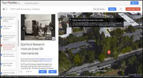
Screenshot: Google Tour Builder Beta
Once a tour has been built, it can be followed along in full-screen mode.
A downside to Google Tours is its limited sharing options, as it can't be embedded and can only be accessed through a link.
As it's still in beta and an 'experiment', it's a tool to watch as it could develop further and potentially include more sharing options in the future.
Another one to watch is Timescape.io , which builds similar experiences to Google Tours using the Leaflet JS library. It is free to use, collaborative, and doesn't require a plug-in to be viewed by others – although its sharing options are similarly limited at the moment.
For satellite imagery that doesn't require the download of an additional plug-in, reporters can head over to NASA for free data.
This is what the team at ProPublica did this year when mapping out the changes in landmass on the coast of Louisiana.
Knight-Mozilla fellow Brian Jacobs said he and his team became "space journalists" in the process of creating the interactive – their full list of resources and tools is available on GitHub .
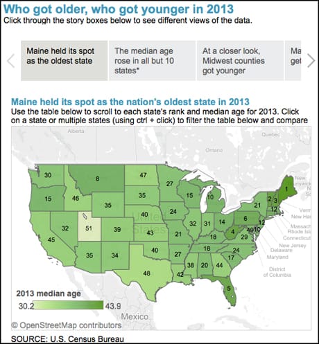
Screenshot: Maine continues to age faster than most of the country, Bangor Daily News using Tableau Tableau Public , another data journalism staple, is a free visualisation tool that allows users to build interactive maps.
To use Tableau, you need to download the software onto your desktop, but the interactive maps created with it can easily be shared online afterwards through embeds into stories or blog posts.
The Tableau team runs weekly training sessions helping people get started with the tool, and there are plenty of tutorials on the site to help out at first and show what's possible. Check out this video explaining the types of maps that can be created with Tableau and how you can do that.
TileMill is an open-source design studio from MapBox that has been used by The Financial Times , for example, to visualise location data.
It allows you to import data sets and customise your map using CartoCSS, then add an interactive legend, among others features.
The code for TileMill is available on GitHub, and the MapBox website features a number of tutorials ranging from a basic introduction to TileMill, or what it calls a 'crash course', to more advanced guides explaining everything from terrain data to working with satellite imagery.