How The Wall Street Journal creates mobile-friendly interactives
Elliot Bentley, graphics editor at The Journal, explains the thinking behind designing interactive maps for mobile
– 4 min read
Elliot Bentley, graphics editor at The Journal, explains the thinking behind designing interactive maps for mobile

This article was migrated from an old version of our website in 2025. As a result, it might have some low-quality images or non-functioning links - if there's any issues you'd like to see fixed, get in touch with us at info@journalism.co.uk.
Journalists and newsroom developers can still find working together to build tools and meaningful data visualisations a challenging process. But now there's another element to consider: how will the interactive look on a smartphone?
At The Wall Street Journal, the mobile aspect is at the forefront of developing graphics and interactive elements to accompany or enhance the reporting, particularly when working with large data sets.
The outlet's most recent example, published yesterday , is an interactive map that shows the different levels of nitrogen dioxide across Europe and how polluted the air is in specific countries or cities due to emissions produced by diesel cars.
The map was created by Elliot Bentley, graphics editor at The Wall Street Journal, as a follow up from the Volkswagen story – a scandal which erupted last month, as it was revealed the car manufacturer had cheated on emission tests results for around 11 million diesel vehicles sold in recent years.
Using geolocated data collected by the European Environment Agency (EEA) from 4,000 air quality monitoring stations in Europe, the map allows readers to either look at the bigger picture by comparing pollution levels between countries or drill down into a specific location.
"Our reporter, Matt Dalton, was looking at how diesel cars sell much better in Europe and whether the emissions that they produce are also higher," Bentley told Journalism.co.uk, "and as soon as we came across the EEA database, a light bulb went off in our heads that we should do an interactive map."
The interactive was built explicitly for this piece and Bentley spent roughly four and a half days developing it, using different technologies that he was already familiar with.
For example, Leaflet JS allowed him to zoom in and out of the map and focus on particular areas, while tools like Leaflet KNN and Mapbox enable readers to search the map using a specific location, returning results from the 10 closest air monitoring stations out of the total number of 4,000.
According to Bentley, building such interactives sometimes requires "slotting together bigger parts and then just smoothing it all together to make it do want you want it to do", but he still had to make some adjustments to the code in order to make sure it displayed the correct information.
Maps are often the more obvious or easier choice when working with large data sets in the newsroom, but they shouldn't necessarily be a port of call for every story – at The Journal, the main question is whether or not it would work on mobile and what connections readers are able to draw between the different elements included.
"What we really wanted to convey with this piece is how bad pollution is across Europe and that something probably needs to be done about it, beyond making sure that car manufacturers are not cheating on their tests," said Bentley.
He explained that he is "often hesitant to do maps" because "a big, full screen map is not very mobile friendly or fun to pan around it and poke at little dots" – for that reason, the initial prototype of the pollution tool included only the search box for readers to compare different results, before it became clear that "the map should really be a focus".
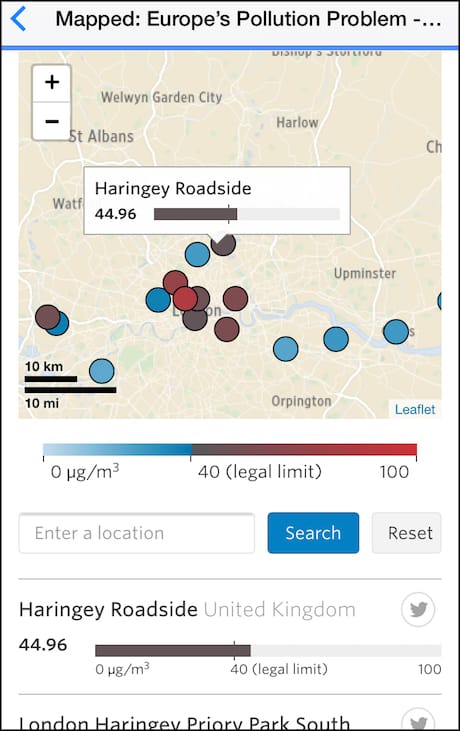
Screenshot of The Wall Street Journal's pollution map on mobile
"This is a problem that I've been coming up against since I started doing interactive graphics and I'm still trying to work out what's the best way to do maps on mobile," he said.
"[Maps] are not particularly fun to interact with unless you've got nice, big icons on them, but these icons can also get in the way, so I think this is almost like a work in progress."
The map's current version draws inspiration from apps such as Google Maps and AirBnb, which Bentley said "manage to integrate interactive maps very smartly on the phone".
He also gave the example of The Guardian's recent property prices map , which on mobile included a button for readers to interact with its full version or opt out of it at any time.
"I think the challenge at the moment is how do you present big datasets on mobile, where you have such a small screen and can't rely on things like tool tips or hover – so you have to be smart about it and summarise information."
But even if this is a recurring design issue, Bentley said he tries to do everything from scratch and avoid using templates, "unless it's a really obvious or universal structure that you can use multiple times".
"I might reuse code from an older project, but I think if a design problem is not solved, it's important to continue to approach it with a fresh outlook."
"This is not a complicated or fancy interactive, but it is based on an interesting dataset and sometimes that's all you need – you just have to present it in a clear way for the audience."