Tool for journalists: DataProofer, for identifying errors in datasets
This tool can save journalists time by automatically looking for and flagging up potential mistakes or missing information in their data
– 3 min read
This tool can save journalists time by automatically looking for and flagging up potential mistakes or missing information in their data

This article was migrated from an old version of our website in 2025. As a result, it might have some low-quality images or non-functioning links - if there's any issues you'd like to see fixed, get in touch with us at info@journalism.co.uk.
What is it? A tool that automates the process of checking a dataset for errors, potential mistakes or missing information.
Cost: Free
How is it of use to journalists? For journalists working with data, whether analysing or visualising already existing information or creating original datasets through their own reporting, verifying if the data is reliable and usable is a crucial part of the process.
Checking a dataset manually to spot potential errors and to clean the information can take a long time, depending on the size of the dataset, and it can also introduce the possibility for additional human mistakes.
DataProofer is an open-source tool developed by Vocativ with support from the Knight Foundation Prototype Fund to speed up this process, by running a selection of automated tests to identify inaccuracies.
How it works:
First, download the .zip file corresponding to your operating system (macOS, Windows or Linux). If you are using a Mac, drag the DataProofer app into your 'Applications' folder to install it.
Open DataProofer and upload the dataset you wish to check. You can upload a dataset from your computer in any of the supported formats – XLSX, XLS, CSV, TSV, PSV – or copy and paste the URL or ID of a Google Spreadsheet. I used this Google Spreadsheet of 'dirty data' made by Paul Bradshaw of the Online Journalism Blog in 2013, which he created to show some of the typical problems that data cleaning techniques and tools can be used for.
After loading your data, you can choose from the list below the upload field which tests you would like to run on your dataset. There are various options, separated into four categories: information and diagnostics; core data tests; statistical data tests; and geographic data tests, such as invalid latitude and longitude coordinates.
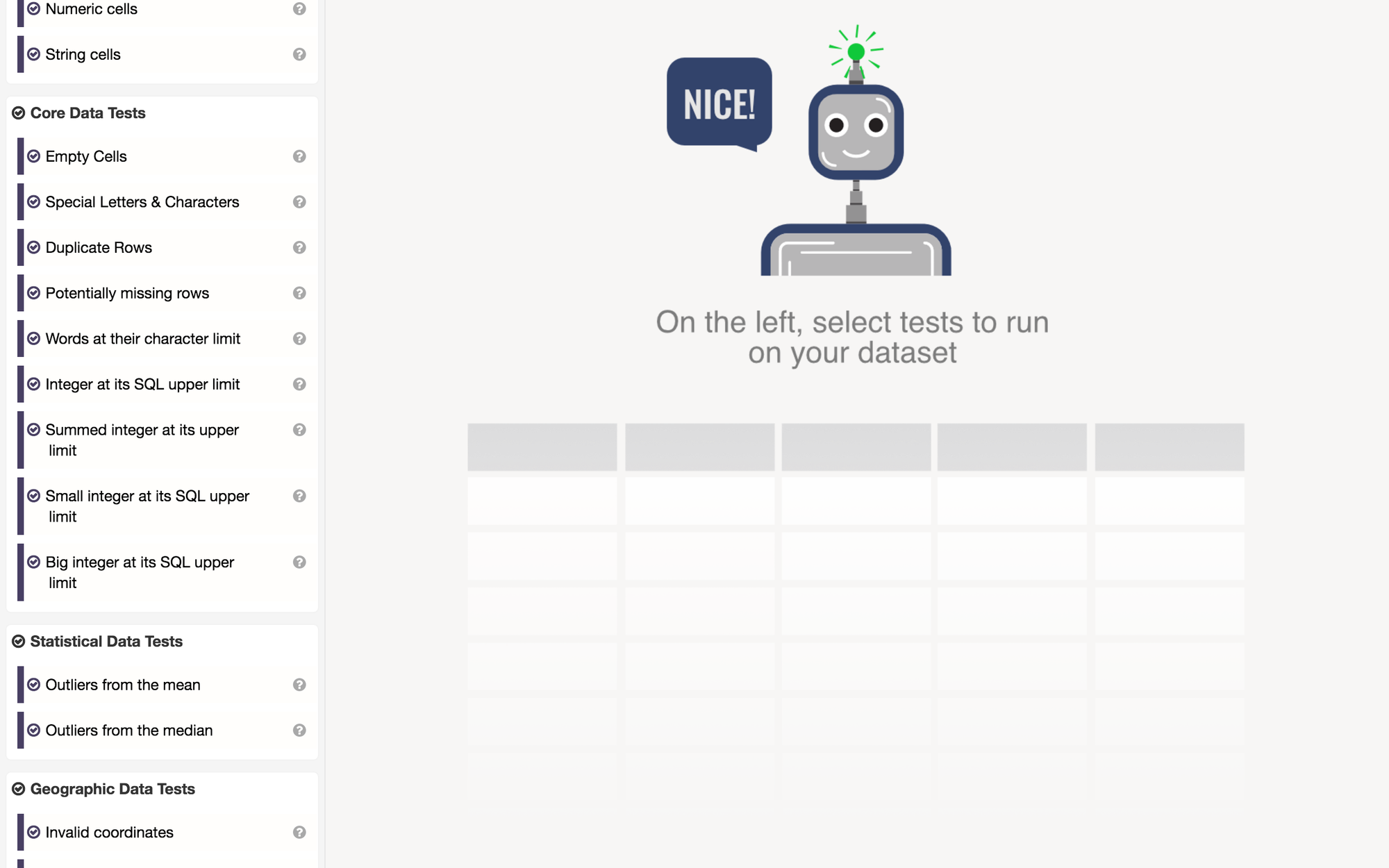
Tick each of them if you wish to run all the tests included in each category, such as determining the percentage of rows that are numbers, calculating the percentage of empty rows, checking for identical rows, or checking with cells contain special characters that can cause errors with data visualisation tools. If you only want to run certain tests, untick the boxes of the ones you do not need to use, and click the 'run tests' button at the top.
The tool will return a percentage of accuracy as well as the number of tests your dataset has passed, showing a breakdown of the positive results and flagging those identifying potential mistakes or inaccuracies. In our example, the dataset scored 58 per cent, and passed seven out of the 12 tests that were run on it.

Hover over the problematic tests to get additional information and suggestions on what could be done to fix the error, for example replacing an odd character with a space or consulting your source again if information is showing up twice in the same way and this wasn't what you intended.
The tool was launched in 2016 and there have not been any updates to it since, so consider using it alongside other methods for cleaning up data, as the results may not be extensive. The code is also available on GitHub for those who might be interested in looking for ways to develop it further.


