

It began with one of the investigative reporting team asking: "You're good with spreadsheets, aren't you?"
And this was one hell of a spreadsheet: 92,201 rows of data, each one containing a detailed breakdown of a military event in Afghanistan. This was the WikiLeaks war logs.
This piece is about how we handled that data, how we extracted stories from it, and what it told us about a war that has claimed the lives of more than 300 British service men and women. The task we faced was probably not for any reporter who thinks data is not for them, that numbers are boring and spreadsheets are for accountants. It's only boring if you’re not interested in journalism.
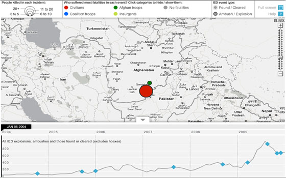
Guardian interactive timeline charting IEDs, ambushes and fatalities
We've had to handle major datasets before. The release of the treasury's huge spending database (Coins) earlier this year was bigger and scarier. The last government had refused to release it – the coalition published it within weeks of taking power. It had every item of public spending, by every department, since 2005. Millions of items, intrinsically complicated and difficult to manipulate.
But that complicated dataset gave us real news. Our developers built the Coins explorer, which allowed Guardian reporters and users to search for stories. They unearthed great tales.
With the WikiLeaks files we had the same criteria of success: help our journalists access the information, break down and analyse the data – and make it available for our users.
These are my top five tips for dealing with a large dataset like the war logs:
1. Get the numbers into a format you can use
A big breakthrough for us with the war logs was Guardian developer Harold Frayman getting the data onto a basic database. Nothing overcomplicated but it allowed reporters to search for specific incidents and stories – and allowed us to download subsets of the data
2. Make your pool smaller
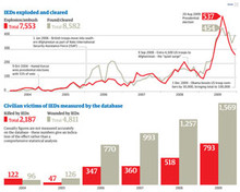
Huge datasets can seem intimidating – so examining just part of the dataset first is a good place to start, minimising the area of data you've got to analyse. So, with the war logs, we chose IEDs (improvised explosive devices) as a good place to start as we knew there had been a rise in IED attacks. This subset was a lot smaller – and easier to analyse.
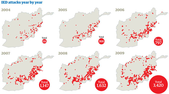
Guardian chart showing the increase in IED attacks between 2004 and 2009
3. You can do a lot in Excel
Or any basic spreadsheet package, for that matter. Often just being able to carry out a pivot table report (this is where you ask the spreadsheet how many times the word 'red' occurs, for instance) will give you everything you need. Using these reports on the IED data gave us a breakdown of attacks by month and year and by place – and casualty figures for each. Similarly, the filter function is incredibly useful for just showing the data you need at that moment, or reordering it to get top 10 lists and so on. Don’t get intimidated into thinking you have to be a trained programmer to understand data – most of what you need is probably sitting on your computer already.
4. Treat data like you would any information
Some reporters treat data as if it's something special, as if it's sacrosanct because it’s a number. Or they're intimidated by it in a way they would never be by a tip-off or a source. If you apply the same rules – is it interesting? Why does it say what it does? Who is it from? – then you should get decent results.
5. The numbers do lie
Sometimes they do – just because something is in a spreadsheet, doesn’t mean it’s true. Then Tory shadow-home secretary Chris Grayling got into trouble before the election for misreading crime figures. Get the numbers wrong and someone will correct you. The same tests of rigorousness still apply – as does the tedious but important truth: read the notes. They're in small writing and often difficult to find, but they matter, they really do.
One of the key lessons for us in the whole process was how much specialist reporters with expert knowledge still matter. Afghanistan correspondent Declan Walsh could read the WikiLeaks war logs, recognise incidents and judge how accurate the report was. Data without analysis is just data, but expert knowledge can make that analysis happen. This open data revolution could be the biggest boost for investigative reporting that any of us have ever seen.
Now, if you're still asking yourselves whether data is really journalism, then the question surely is: where have you been for the last year?
Read more about the Guardian datajournalism operation at this link.
Free daily newsletter
If you like our news and feature articles, you can sign up to receive our free daily (Mon-Fri) email newsletter (mobile friendly).


