5 ways newsrooms covered the Winter Olympics 2018 with interactives and data visualisations
Graphs, illustrations, and conversational interfaces have all featured in publishers' coverage over the past few weeks


Graphs, illustrations, and conversational interfaces have all featured in publishers' coverage over the past few weeks

This article was migrated from an old version of our website in 2025. As a result, it might have some low-quality images or non-functioning links - if there's any issues you'd like to see fixed, get in touch with us at info@journalism.co.uk.
Over the past few weeks, audiences all around the world have been keeping up with updates from the Winter Olympics in Pyeongchang, South Korea, with news outlets embracing creative ways of storytelling to captivate audiences.
Interactives and visualisations played a huge role in the coverage, providing people with complex information on the individual races, competitors and leaderboards in a way that's easy to understand.
Here at Journalism.co.uk, we've been collecting some of the most visually interesting pieces from a variety of news organisations, such as The Times, The Guardian and The Washington Post.
Conversational interfaces – The New York Times
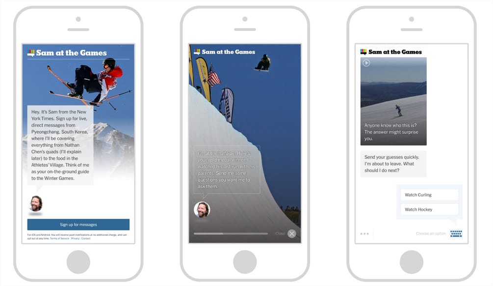
In a bid to create a more intimate, personal experience with readers during the Winter Olympics, The New York Times used direct messaging to update readers with results, photos and behind-the-scenes coverage.
Similar to the project the publisher undertook during the Summer Olympics in 2016, readers who 'signed up for Sam', got messages with updates from the games in real time.
However, for the latest version, the NYT used a native mobile app – a less-expensive method than SMS – as well as new backend personalisation features developed from a polling tool, designed to connect readers with coverage they care about.

People were even able to reply to these messages, which made it easy for the developers to determine whether sports fans wanted to see more content about a particular topic or if they were not as interested as assumed.
Interactive videos – Eurosport
Pan-European broadcaster Eurosport helped audiences discover new sports and disciplines through an Olympic Sports Explainer video series, which displayed the rules, techniques and scoring principles of each Olympic discipline in videos under two minutes each.

The visuals worked without sound and used animation and graphics taken from real games to explain details such as how points are scored and how penalties occur.
Photos as drawings – CNN
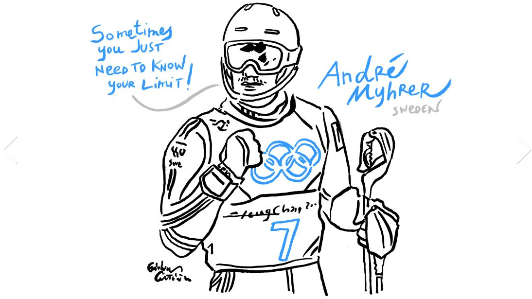
For CNN's coverage, the Italian artist Gianluca Costantini has drawn sketches of the most important moments of this year's Winter Olympics, such as Lizzy Yarnold's gold triumph for TeamGB or the fascinating Opening Ceremony.

The artists used photographs from the event to create the images, and drew around them to illustrate moments from the Games or better describe what was happening at the time.
Charts, bars and graphs – the Guardian
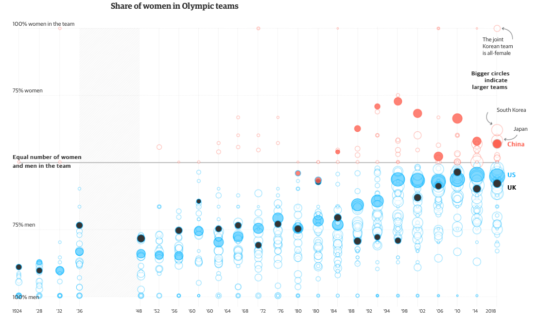
In order to show how far women's sports has yet to come at the Winter Olympics, the Guardian produced a range of visuals to help audiences understand the key differences between men and women's sports.
The coverage included moveable sliders where audiences had to guess the correct answer, as well as bar charts, scatter plots and key facts and figures from the Games over the years.

Using the colour red to demonstrate women and blue for men, the publisher created a scrollable experience which aims to show, not tell, the facts.
Moveable graphics – The Wall Street Journal
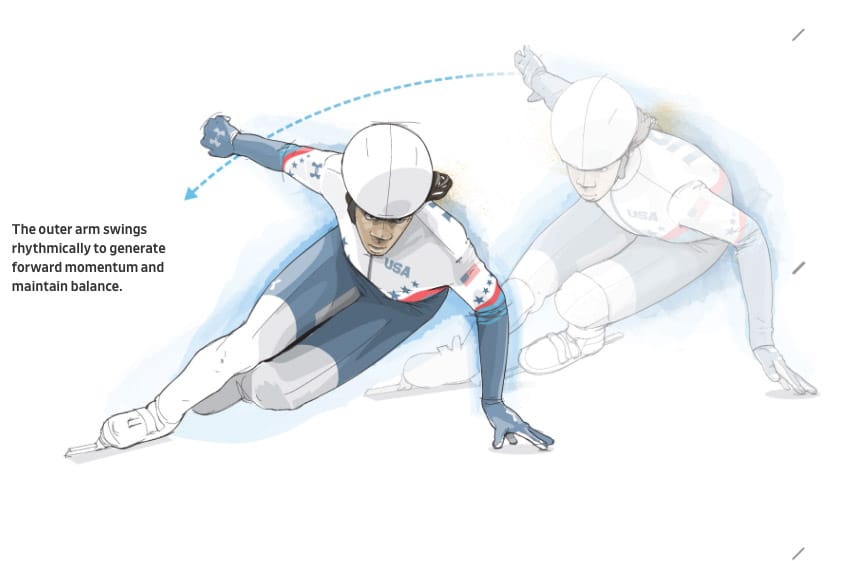
The Wall Street Journal used moving graphics to show how athletes have perfected their techniques in the past few years, nearly halving their time in some disciplines.
When a user scrolled down the page, the graphics updated, whether from picture to picture or within a bar chart or speed graph.
