


Credit: Michael Bruntonspall on Flickr. Some rights reserved
The Guardian's in-house analytics platform Ophan was born at a hackday organised by the outlet almost three years ago.
Its aim was to create a "feedback loop" to make it easier for journalists to see in real-time how changes made to headlines, for example, might affect search traffic to stories.
Speaking to Journalism.co.uk, Chris Moran, the Guardian's digital audience editor, explained Ophan was "all about informing decisions around content".
"We don't know enough about the internet as a publishing medium," he added.
"We know everything about print, pretty much, there's not many tricks left in the bag, we've done it for 200 years and we're used to it. But the internet's changing all the time, as much as anything else."
An idea central to Ophan, said Moran, was for it to be useful to everyone working at the outlet, something he referred to as the "democratisation of data".
Information is designed to be clear and simple to understand so that even the busiest journalists can see at a glance how stories are performing.
In addition, a browser bookmarklet allows any reporter looking at a Guardian page, inside or outside the outlet's King's Cross office, and even on mobile, to see the data on a particular story in just one click.
There is also a section which shows what page stories appeared on in the newspaper and how many page views they received online, which is a way of "connecting" editors who are not so print focused.
Ophan was created by the Guardian's director of architecture Graham Tackley, who recently introduced new features with an increased focus on attention time.
Here is a run-through of some of Ophan's key features, with examples referring to a story published last week on families facing eviction from the New Era housing estate in east London.
Page views
Though Moran noted the Guardian has to pay attention to unique visitors because of ABCs, page views is one of the most important metrics to the outlet.
While page views may be seen by some as an old fashioned metric compared to, say, attention time, Moran explained that for the Guardian there are a number of benefits.
One advantage is they are "linked directly to referral and that kind of information," so for example, a click can be matched to a user coming directly to the site or from Facebook, even if it is the same person, which makes it easier to cross-analyse the data.
Also, in terms of democratising data, Tackley noted that page views were a simpler metric for most people to understand.
"When I've talked to people about the more derived metrics than page views they... really genuinely have no idea about what they actually mean," he said.
And although Tackley acknowledged page views are "a measure with failings" – for example, they are seen by some as encouraging clickbait – he said most people have a "natural understanding" of some of the things that are wrong with them.
Referral traffic
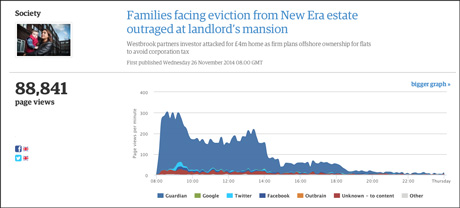 Ophan/Guardian Press Office
At the top of the page is a line graph showing minute-by-minute the number of page views coming direct from theguardian.com in addition to other platforms such as Google, Twitter and Facebook.
This is "the most important graph", said Moran, the part which "tells a story".
Here you can see Guardian traffic shoot up a few minutes after the story was published, when it placed in the top spot on the homepage.
There is also a lift in Twitter and Facebook referrals after around an hour, when the story was posted to the Guardian's main accounts.
In this case Facebook traffic is significantly lower because Moran admits he "mis-sold it on Facebook," using too much text and a less engaging photo than the Twitter post.
There are also no referrals from Google. This is because the New Era estate story is not something other outlets are writing about, explained Moran, adding "if nobody else is writing about this story, getting it into Google News is probably not going to happen."
The kind of promotion given to each story is different depending on format and subject.
As Moran is aware that the New Era story does not perform well on Google, he explained that "our focus will naturally be... Twitter and Facebook".
Reading habits
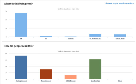
Ophan/Guardian Press Office
This section of Ophan shows page views by geographical region. Users can also break geographical data down by country or cities to get a more detailed overview.
It also shows what device readers are coming from, whether desktop browser, phone, tablet or the Guardian app.
In the case of the New Era story, the graphs above shows that only 37 per cent of readers came from desktop.
There is also another bar chart (not shown) displaying referral traffic which can be split to show more detailed data, such as what pages on the Guardian site drove traffic to a certain story.
Social traffic
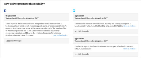
Ophan/Guardian Press Office
This sections shows the exact Facebook posts or tweets which drove traffic to the story. In this case, noted Moran, the first tweet (921 click-throughs) is "really, really close" to being as successful as the Facebook post (1,355 click-throughs).
"Normally that's radically different," he added. "This is where I can tell I've fucked up."
Unlike outlets such as BuzzFeed, who put a lot of stock in the social shareability of stories, the Guardian is more focused on referral traffic generated by social platforms.
"It's easy to rely on shares, 'likes' and retweets to measure the effectiveness of something," said Tackley.
"I'm always nervous about that because I'd rather actually know how many people read the article... those things are important to help us understand what's really doing well, rather than what's just generating tweets."
However, social interactions becomes a more useful metric when taken into account alongside page views.
A post to the Guardian's Facebook page following the death of Nelson Mandela, for example, received 40,000 'likes' in its first hour.
Despite this, Ophan data showed just 10,000 referrals from Facebook in the same time span, meaning just one in four people who 'liked' the post clicked through to the actual article.
"In those circumstances, the 'likes' are not a sign of engagement," said Moran. "The page view is."
Reader trajectory
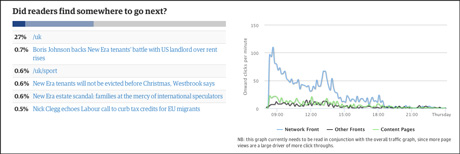
Ophan/Guardian Press Office
The graph above shows in dark blue the percentage of readers who went from this story to another article on the Guardian site, in light blue the readers who returned to the homepage, and in grey the proportion that 'bounced' – left the site without viewing any more pages.
In this example, 30 per cent of people who read this article returned to the UK homepage afterwards.
This metric is interesting, said Moran, because it may reflect the quality of the article and the loyalty of the readers.
It also allows journalists to see the effect of linking to a related article or archive content in the body of their story.
Attention time
This section shows how long people stay within the article page before leaving, and also includes a word count and 'skim reading' time, which estimates the amount of time it takes to read the article at around 400 words a minute.
"We are still playing with how we present this," said Moran, "it's a new metric and we don't yet quite know what 'good' is."
"It's also teaching us something about clickbait, or the presentation of something as clickbait, and being honest about exactly what it is and giving the reader context to click on it."
Instead of displaying a word count for context, Moran and Tackley are considering showing the average attention time for articles on similar subjects.
"It's all about contextualising it and making sure we understand it," said Moran. "It's not just telling us about our journalism... it's also telling us about digital behaviour," he said.
For example, journalist Roxane Gay wrote a story about the celebrity nude picture hack which Moran said received page views in the "hundreds and hundreds and hundreds of thousands".
However, the attention time showed a high number of people visiting the article and leaving again very quickly, most likely hunting for a link to the original pictures.
In this instance attention time was imperative to providing extra data around the story, as it showed the number of people who were genuinely interested in the story.
Key influencers
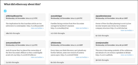
Ophan/Guardian Press Office
This shows the top six tweets in terms of generating click-throughs, a feature Moran explained can teach the Guardian's social team something about what wording and format works best on Twitter for each individual story.
A good tweet can also work as a "sell" to Facebook, Moran said.
This section also offers journalists "a really simple way of understanding who the really genuinely influential tweeters are around their content," he added.
- There will be a session on measuring success at the next news:rewired digital journalism conference on February 3, 2015, at MSN UK in London.
Free daily newsletter
If you like our news and feature articles, you can sign up to receive our free daily (Mon-Fri) email newsletter (mobile friendly).
Related articles
- DCMS-backed media literacy programme is supporting vulnerable internet users
- Tip: Lessons from the Guardian's membership model
- Advertorial: Improving strategic content planning in your newsroom
- Behind the scenes of A/B testing: benchmarks and insights from three digital publishers
- 12 replies to common objections to using data in the newsroom


