How to create a simple interactive graph with Plotly
Visualise your data and embed interactive, annotated graphs in your stories for free
– 4 min read
Visualise your data and embed interactive, annotated graphs in your stories for free

This article was migrated from an old version of our website in 2025. As a result, it might have some low-quality images or non-functioning links - if there's any issues you'd like to see fixed, get in touch with us at info@journalism.co.uk.
Stories are now increasingly grounded in numbers as people generate more and more data while going about their daily routines.
Making sense of this data and finding stories in it is no longer an area of journalism that can be labelled as inaccessible for the majority of reporters.
There are plenty data visualisation and analysis tools out there that can be used entirely for free, or have a number of features available without payment.
At Journalism.co.uk we've been regularly using Datawrapper, Infogram and Google Sheets to name a few, and we have highlighted many others in our pieces.
Plotly is perhaps one of the more complex resources, but it's free to use and enables its users to create customisable graphs. This tutorial will show you how to create a simple interactive, annotated line graph, using data from the Audit Bureau of Circulation.
You will need a Plotly account to start using the tool – there are options to connect your social media profiles to Plotly and log in with your Twitter account, for example. Plotly also has an 'Explore' tab where you can see other data visualisations that users of the site have created, and get an idea of what types of graphs Plotly can make. The 'Workspace' section is where you can create your own.
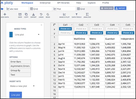
To start, you can either upload a file of your data by clicking 'import', or copy and paste it from a spreadsheet after adding a 'new grid'.
The columns are numbered by default – to change the names of each column to how you'd like them to appear in the visualisation, right-click anywhere on the row you want as a header and select "use row as column headers".
Another additional step compared to other tools like Infogram which automatically visualise the entire dataset, is to decide which columns and rows you actually want to appear in your graph.
This does mean there are a few extra clicks involved if you're looking to visualise the entire data set, but it also means you can compare elements and create different visualisations after uploading a single set of figures.
Plotly saves the data set to your workplace, and you have the options to make it public or private or to invite collaborators in a similar fashion to Google Drive. To access these options, click the 'share' button in the top right corner, title and save your graph, and then decide the privacy settings you'd like.
Once you're happy with your data in this worksheet, click 'make a plot' in the menu just above the spreadsheet or use the menu to the left.
You can choose the type of visualisation, or 'plot', that fits your data from a drop-down menu – I'll be making a line plot. Click the button at the end of the menu to generate your graph.
Your plot will be created in a new tab, and it can be saved and shared independently from the dataset. You could, for example, have a private dataset and a public visualisation that only includes a section of your complete data.
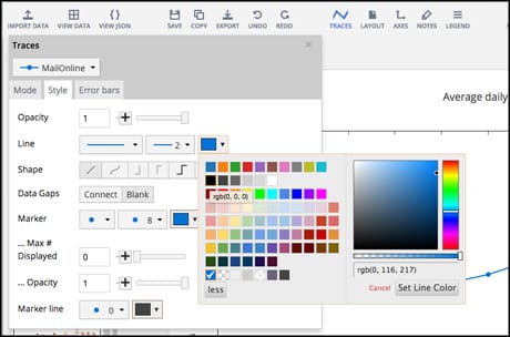
There are different design options for your graph on the left hand side of the page, and each one has a customisable background and colours.
The icons in the upper right corner of the plot function as an interactivity menu, where you can zoom into the graph or decide the type of information you get when you hover over the data points.
You can tailor your graph to a house style or simply switch colours around by clicking the 'traces' button above your plot.
To annotate your graph, click on 'notes'. Annotations appear in the form of an arrow pointing to a certain part of the graph, with text attached to it.
To move the arrow around the graph, click on the arrowhead and drag it – to extend or shorten the arrow, click and drag on the text.
You can customise the arrowhead and the colours of the annotation from the 'notes' feature.
One downside of annotating a graph is that additional notes can make the visualisation appear too busy and difficult to understand, especially when you're planning on embedding it in a page with limited space. So notes are best used sparingly.
Once your graph is finished, click 'share' to decide the privacy options for your graph and to generate an embed code.
The interactivity menu will also appear in the embed.
There used to be something here that couldn't be migrated - please contact us at info@journalism.co.uk if you'd like to see this updated!
Click 'play with this data' to see a full-sized version of the graph and access the data.