The Washington Post launches newsletter to help readers understand graphs and charts
"How To Read This Chart" is WaPo's latest weekly digest which seeks to make sense of the numbers shaping the news agenda

– 2 min read
"How To Read This Chart" is WaPo's latest weekly digest which seeks to make sense of the numbers shaping the news agenda
This article was migrated from an old version of our website in 2025. As a result, it might have some low-quality images or non-functioning links - if there's any issues you'd like to see fixed, get in touch with us at info@journalism.co.uk.
The Washington Post has launched a newsletter that dives into the data behind the week's major news and guides readers through ways visualisations could be improved.
"How To Read This Chart" is penned by popular national correspondent Philip Bump who analyses charts about economics, pop culture or politics. The Washington Post is focusing on newsletters as a way to diversify its news offering and meet different needs.
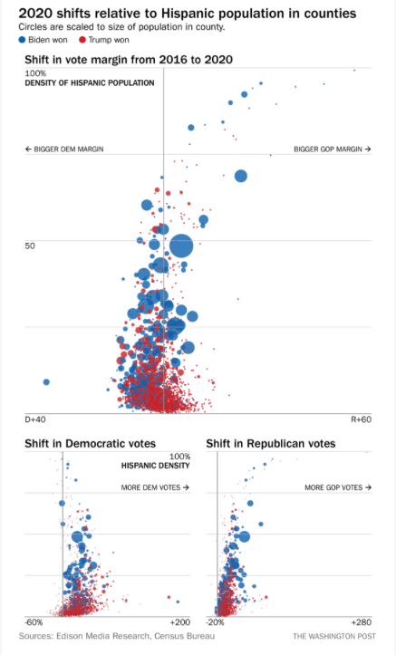
The first edition on 11 December saw Bump dive into what he dubbed "the 2020 tornado" - the shift in the presidential vote in each US county from 2016 to 2020.
Through humour and simple explanations, he demonstrates how the most heavily Hispanic counties shifted toward Trump. This is put into context by the renewed debate about the solidity of Hispanic support for Democrats making the news.
"Charts and visualisations are relegated to specific types of articles instead of being a tool like photographs that can better illustrate a story," says Bump in an email to Journalism.co.uk.
"By focusing specifically on how charts are used well and amplifying the process for making a good chart, the hope is that both audience and the creator will feel more comfortable in presenting data visually."
Even reporters can get confused by charts, let alone audiences. But Bump spends a lot of time in his day job creating visualisations centred around the news agenda. The idea for the newsletter is to create an accessible way for people to learn a bit about how and why charts were made.
"The workflow for the newsletter is fairly simple," Bump continues. "I find a chart that I think is interesting or informative and I explain why. Then I sandwich that between dumb jokes and semi-cogent ramblings and throw it in the oven."
The Post opted for newsletters primarily for the consistency of delivery it presents, in a way that does not overlap with the weekly column in the paper or a weekly digest on the site. Newsletters aim to appeal to a sense of community and continuity for readers.
Secondly, it is easier to adopt an informal approach in a newsletter. The wit and idiosyncrasies Bump's readers have known to love are all on display here.
The first newsletter opens with: "I am one of those people who, at a social event where I don't know anyone, has no idea how to strike up a conversation."
And it ends with: "Anyway, it was nice to meet you. I don't really know how to end conversations at social events either, so sometimes I just awkwardly sort of leave —"
