


The Olympic Games kicked off in Rio on 5 August, and with so much data available about each sport, participating nations' medal counts or the host nation's budgets, there are many stories to be found in numbers.
Journalism.co.uk rounded-up some of the data stories published during the first week of the Olympics, to explore how news outlets are using the available data in their reporting and how they inject creativity into the process of telling these stories.
This is by no means an exhaustive list, and we are planning another round-up at the end of the Olympics Games. Let us know what we've missed from the first week and share any new data stories with us by tweeting us at @journalismnews.
A visual history of which countries have dominated the Summer Olympics – The New York Times
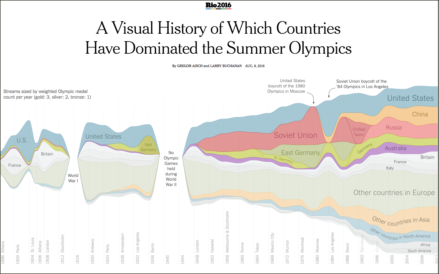
NYT's Gregor Aisch and Larry Buchanan visualised the number of medals each country has won in each Olympic year, starting from the games in Athens in 1896, when the medals were split between just 10 countries.
They visualised the medal count per sport in a series of graphics that reflect not just each participating nation's sporting speciality but also historical events – no Olympic Games were held during the two world wars, and twelve of the former Soviet republics competed under the name "Unified Team" at the 1992 Summer Olympics in Barcelona.
Who is your Olympic body match? – BBC

Using data from the Olympic Data Feed, the BBC finds people's closest "body match" among 10,500 athletes.
The interactive asks for your height, weight, date of birth and gender, and provides your top three matching athletes, as well as insights on where you rank compared to the height, weight and age of Olympic athletes.
How Sun Yang caught up with Chad le Clos to claim gold in the 200m freestyle – The Guardian
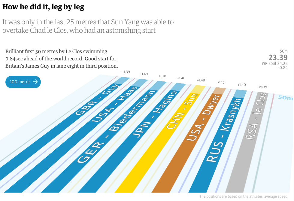
The Guardian's Apple Chan Fardel and Carlo Zapponi visualised athletes' times in the 200m freestyle race, showing how China's Sun Yang, who was behind South Africa's Les Clos for three quarters of the race, eventually won the gold medal.
The feature also includes a visualisation of previous medal winners of the 200m freestyle race and the time it took them to the complete the race.
It shows that Sun Yang's gold-winning time in Rio would have won him a silver medal in London in 2012.
Rio Olympics 2016: is Michael Phelps the most successful Olympian? – The Financial Times
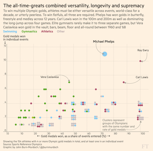
FT's John Burn-Murdoch took on the task of determining whether Michael Phelps is the most successful athlete at the Olympic Games in modern history, and how someone would even measure this. Should medals won as part of a team count the same as medals won at individual events for example?
He called his attempt a "light hearted exercise", writing that "comparing across generations – let alone centuries – in sport in a meaningful way is close to impossible".
Since the visualisation was published on 8 August, Phelps has won another three gold medals, putting his total count at 22 gold medals – ahead of the previous record-holder, Leonidas of Rhodes, who reigned supreme for over 2,000 years.
Michael Phelps vs. Himself – The New York Times
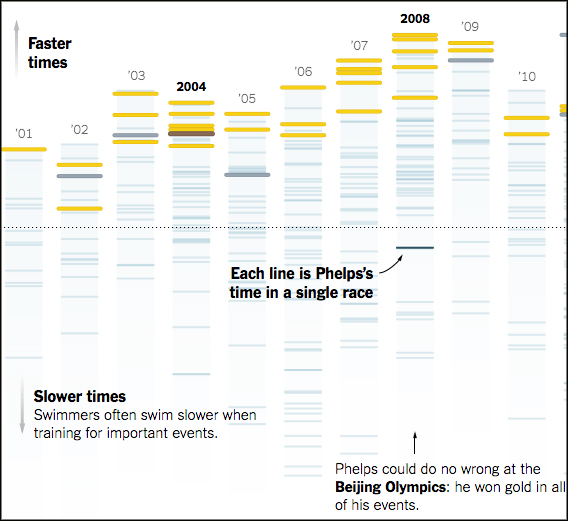
NYT's Derek Watkins and Larry Buchanan analysed Phelps's individual race times, starting from the Olympic Games in Sydney until the races in Rio.
The data shows how Phelps's performance has changed over time – while he won gold at the 400m race in Beijing, he placed fourth in London and did not enter it this year.
How does Team GB's Rio 2016 medal tally compare with London 2012? – The Telegraph
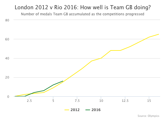
Ashley Kirk of The Telegraph addressed concerns that Team GB is not winning as many medals as expected in Rio by comparing the current medal count with the London 2012 count at this stage in the Games.
Kirk notes Team GB won 16 medals by the end of the fifth day in Rio, compared to 15 in the same period in London, and many events have yet to start.
Sizing up the Olympics – The Washington Post

To illustrate the size of Olympic equipment, tracks and other locations, The Washington Post put together a visualisation comparing them to common objects including a soda can and a large pizza box.
The feature reveals more elements as readers scroll down the page, and hovering over each illustration gives readers more information about the size and the purpose of that particular object or place.
Free daily newsletter
If you like our news and feature articles, you can sign up to receive our free daily (Mon-Fri) email newsletter (mobile friendly).
Related articles
- Tackling new challenges for data journalism, with DC Thomson's Lesley-Anne Kelly and Ema Sabljak
- 40 essential newsletters every journalist should read
- 15 free sources of data on the media industry
- How AI can help journalists track MPs financial interests
- Four tools for journalists to try this summer


