Collaborative data journalism platform Swarmize has launched today to offer editors and journalists better tools for the use of data, including real-time visualisation.
Swarmize, now in alpha, won funding through the Knight News Challenge in June, and has been built at the Guardian over the last four months.
"The Guardian and lots of other news organisations like to use Google Docs for collecting data," said Matt McAlister, the Guardian's general manager of new digital businesses.
"It's free, it's pretty easy to use, however it does have a lot of shortfalls," McAlister told Journalism.co.uk. "Data journalism has moved a lot in the last couple of years, and it [Google Docs] is just too limited for some of the sophisticated stuff that people want to do."I'm hopeful that we'll start to see better data journalism because the tools are moving alongMatt McAlister, the Guardian
Swarmize was launched internally to all Guardian journalists, but the code is freely available on GitHub if anyone else wants to "write their [own] internal version", said McAlister.
Users can create surveys, or swarms, to collect large data sets and the tool then ensures all data is gathered in the right format, without anomalies that might prevent journalists from taking advantage of the full data.
Developer Tom Armitage told Journalism.co.uk: "We get a lot of feedback that actually [journalists] spend most of their time cleaning the data, dealing with invalid post codes [for example], dealing with people answering ridiculous things when they should put in a number and so forth."
Swarmize aims to solve that problem, promote collaboration on projects, and provide journalists with graphs generated in real time from the data.
The platform is also "centralised", said Armitage, meaning the data can be reused and enabling journalists to recycle survey formats or ask the same questions of respondents in the future for "longitudinal" research.
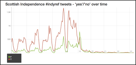
The Swarmize team has also tested the platform's real-time data collection options in other ways, gathering tweets posted with the hashtag #indyref, during the Scottish Independence referendum.
Swarmize counted the number of times 'yes' and 'no' were mentioned, indicating how people could potentially vote, and visualised the data.

Red – yes, green - no; Screenshot from alpha.swarmize.com.
The tool could also be used as a real time feedback clicker during a TV debate. Viewers could tap images on their smartphone to indicate their agreement with a certain speaker, and Swarmize would collect that data and visualise it.
Armitage said this could be used during live blogs on the website for example, or for in-depth analysis once the full transcripts of speeches becomes available.
He said he hoped Swarmize would not just provide an alternative to existing tools, but would inspire journalists to "tell new types of stories" by making data gathering more accessible.
It could also simplify the process of creating interactives, said McAlister, as journalists would no longer have to build specific databases to store data for each project.
McAlister said: "The kind of journalism that happens is affected by the tool that's being used to do it.
"And in this case, I think Google forms and Google spreadsheets as a combination has created a certain type of data journalism, and I think we've hit the upper limit of what's possible with that.
"What I'm hopeful is that we'll start to see better data journalism because the tools are moving along."
Free daily newsletter
If you like our news and feature articles, you can sign up to receive our free daily (Mon-Fri) email newsletter (mobile friendly).


