


Credit: Thinkstock
As parties, leaders, candidates, MPs, spin doctors, leafleters, pollsters, and journalists wearily drag themselves over the line of this year's General Election, dreading the inevitable dance to form a hodge-podge coalition government that the next few weeks will bring, it's probably time to look at all the hard work that news outlets have put in so far.
While there have been countless blogs, dashboards and minisites launched in aid of educating the electorate, we have decided, in the interests of brevity and sanity, to limit this list to recognised news outlets. Do feel free to make any additions in the comments below, however.
So in no particular order...
BBC – Election 2015
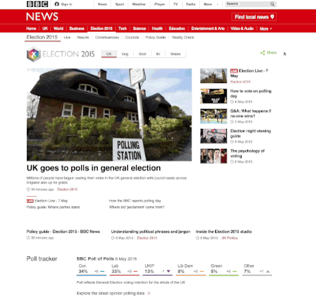
Screengrab from BBC.co.uk of the various election interactives
The BBC's famous swingometer was the first visual device employed by the broadcaster to help voters understand shifting public opinion around UK election, dating all the way back to 1955. It has had a number of refits over the years and is now just one tool in the Beeb's digital toolbox.
The core of the BBC site's Election 2015 section is devoted to its broadcast coverage but they have also included: a poll tracker, with a timeline detailing key events from the past year and their effect on the polls; a constituency guide to help readers find their candidates plus a quiz on local demographics; an interactive policy guide for users to explore various issues, party pledges and build their own manifesto; and a coalition builder, where users are given random election results (within set limits) and tasked with building a coalition. Harder than it sounds.
BuzzFeed - Should You Vote Tactically? interactive guide
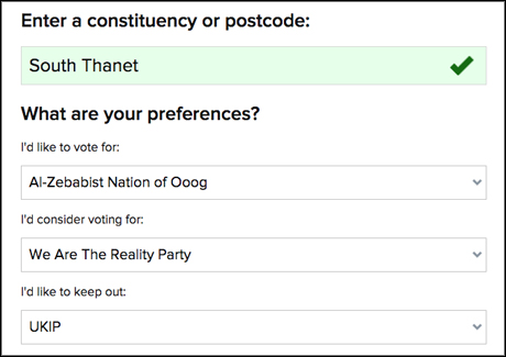
Screengrab of BuzzFeed's guide to tactical voting
BuzzFeed deputy editor Jim Waterson vowed that his publication's election coverage would stick to niche exclusives or stories with broad mass appeal after his talk at Journalism.co.uk's news:rewired conference in February, rather than the everyday speeches which all news organisation will write up.
And that they did, waiting until the day before the election to publish an interactive guide to determine whether the user should vote tactically.
BuzzFeed staff used a range of polls to rank the election chances of every party in every constituency in England, Scotland and Wales to give users advice on how they should vote depending on their preferences.
The Guardian – Projections, polls and policy
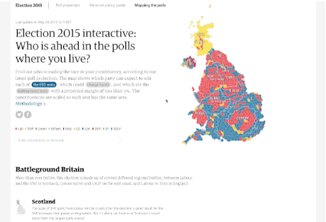
Screengrab of the Guardian's 'battleground' maps
Having hired Alberto Nardelli, whose Tweetminster platform was used by many news outlets in the 2010 election and for other reports on election polls from around the world, the Guardian's election coverage was always going to be data-rich. Two of the three major projects have Nardelli's fingerprints all over them – he literally wrote the methodology.
The first takes all UK-wide polling data to give daily projections on the election result if it were to be held then and there, with further visualisations of the polls mapping how a coalition may form and how seats might change hands.
The Guardian also produced an interactive map based on the polls, detailing any battleground seats and showing how the political make-up of different regions had changed.
The third interactive feature delivered policies from each party deemed relevant to users based on a quick survey. Tick a box for demographic, family, accommodation and transport situation, as well as an area of interest, and see what the parties have to say.
The Sun – SunNation.co.uk

Screengrab from sunnation.co.uk
Billed as "politics without the boring bits", The Sun launched mini site Sun Nation at the start of April to (unofficially) make sure it still had a voice in the national conversation from behind the Murdochian paywall.
Social content like quizzes ("Who are our Page 3 girls voting for?"), picture lists, games and a video of party leaders doing the can-can dominated the site, alongside a curated Twitter wall and reworked editorial columns from the newspaper itself.
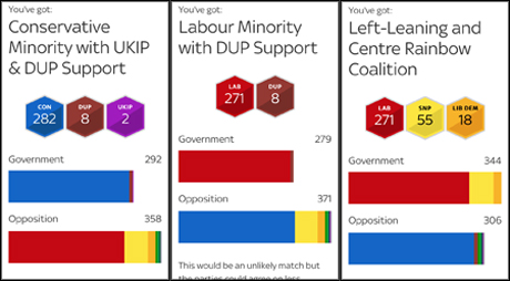
The Financial Times – Coalition calculator
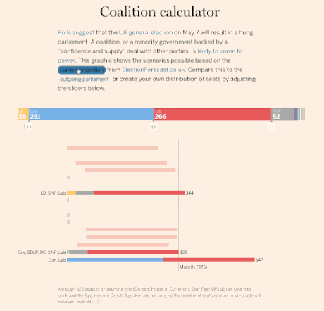
Screengrab of the FT's coalition calculator
The FT has always had a knack for effective simplicity in their data visualisations, one of the reasons FT data journalist John Burn-Murdoch is up for a "best individual portfolio" at this year's data journalism awards.
Like the Guardian, the coalition calculator takes polling data to project the election results and offer different coalition groupings that would result in a majority, built by the newsroom developer Tom Pearson.
Users can compare current projections with the outgoing parliament, or use sliders to change the results and make their own prospective government.
The Mirror – Tweetometer
Screengrab of Tweetometer
"The hashtag election", 'the social media election" and more are all phrases that have been spouted ad infinitum to say that, yes, politics is happening, and yes, social media is happening too.
The Mirror have dived head first into the Twittersphere with their Tweetometer however, adding a clever gaming element to the newsfeed that engages readers with the platform, the outlet, the candidates and the election, all at the same time.
Users sign up with their Twitter account and can pick a dream team of tweeting politicians. The Tweetometer then gives each candidate a score based on the number of retweets as a percentage of their Twitter following and the player with the best team score when polls close wins £1,000.
Sky News – Election 2015
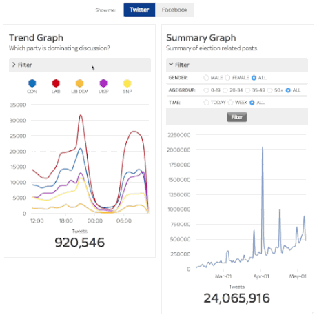
Screengrab from Sky showing the popularity of #milifandom among teenage girls on Twitter and Facebook
Like the BBC, Sky News supplements its broadcast coverage with a range of interactive tools to poke and prod, including a poll tracker (without the key events timeline) and a constituency guide (without the quiz). There are bundles of other features which Sky have built that set it apart, however.
The 'social election' feature, for one, lets users track which party is "dominating the discussion" on Twitter or Facebook, including the option to filter results by demographic, or see how the conversation has developed online over time.
Sky also has a couple of standalone sites dedicated to the election. Biffed, so called after an in-house term for stories that don't make it to TV, focusses on the lighter side of election news, while the mobile-first Stand Up Be Counted has aimed to involve the under-25s in the political conversation directly.
The Telegraph – Election 2015
The Telegraph has had a rough couple of years as various senior figures depart amid accusations of editorial censorship and newsroom turmoil, but new ideas in the digital arm have come just in time for the election.
The 'who should I vote for?' quiz aims to help readers figure out who to vote for, letting users rank political issues by order of preference before embarking on a detailed Q&A into the issues to match voters to parties based on policy. And the interactive map, embedded below, shows predicted winners and extra info for every constituency in the land.
Like so many other outlets the Telegraph has a coalition builder tool based on the latest polls, the first project from the outlet's new 'new formats' team, but going a step further in letting users pick policies from their chosen parties and share their government on social media.
BBC Newsbeat – BallotBots
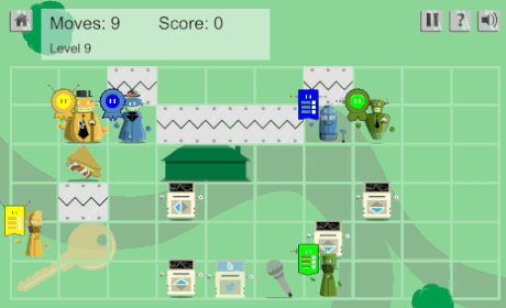
Screengrab of BallotBots, BBC Newsbeat
BBC Newsbeat is a spin-off of the Radio 1 news programme but for younger audiences, and online editor Anna Doble went into detail on the site about how their BallotBots online game intended to teach young people or first time voters about politics.
Players are given a set number of moves to unite voters and politicians from the same party, collecting Facebook and Twitter icons to gain more moves, matching the bots with their manifestos and getting nudged in different directions by 'opinion poll' squares.
With the added hazard of avoiding "PR disaster pits" on the board and gaining extra points for answering questions, the aim was to introduce younger audiences to the basics of the political process.
The Independent – How should I vote
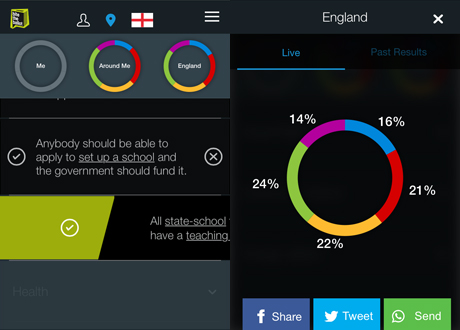
Screengrab from The Independen
Built in association with Bite The Ballot and tech company Verto, The Independent's vote matching quiz takes a Tinder style approach intended for mobile as users are instructed to swipe right for policies they like and left for those they don't.
As the various policies are selected the quiz builds a ring graph of the user's political outlook and compares it to the local and national averages.
The Independent famously refrains from endorsing a party, despite this year running an anonymous editorial urging readers to re-elect the coalition, but it seems its readership largely support green ideas.
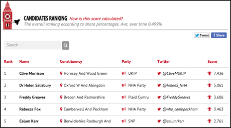
The Memo – Live election monitor
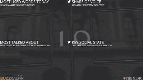
Screengrab of the Memo's live election monitor
New tech site The Memo is not even a month old but launched with a live dashboard detailing how the election is playing out on social media "at a glance".
At the time of launch, editor-in-chief Alex Wood told Journalism.co.uk the dashboard helps readers and reporters see who is being discussed most online while trying to "find the right fit" in terms of presentation as "we can all get a bit of fatigue with social media dashboards".
Sky News – Shaker Maker
Screengrabs of Shaker Maker on iOS
Sky's Shaker Maker is the only truly mobile offering on this list, taking advantage of the motion sensors in smart devices to present the different possible outcomes of the election, based on current polls.
After viewing the latest "poll of polls" users literally shake their phone to be given a random coalition government. The basis on which the coalition might form is explained in a quick sentence, with some more likely coalitions given a deeper, video explanation by political editor Faisal Islam.
Users can create their own coalition by dragging and dropping coloured hexagons of the parties until a majority is reached, and there's an option to tweak the polls to see how that might affect the final count.
Johnston Press – What Matters To Me
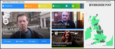
Screengrab from What Matters To Me
As the publisher of a range of regional newspapers, it was always going to be tough for Johnston Press to be both local and company-wide in its coverage.
With the video-based What Matters To Me they have done well though, inviting readers to submit 30-second videos detailing their thoughts on issue – not a party – before selecting the issue that matters most to them and their region.
The number of videos on each topic are then counted to give an overview of what matters most to the Johnston Press readership, smartly side-stepping any issues of partisanship to get to the core of UK politics.
Users sign up with their Twitter account and can pick a dream team of tweeting politicians. The Tweetometer gives each candidate a score based on the number of retweets as a percentage of their Twitter following and the player with the best team score when polls close wins £1,000.
The Lincolnite – MPs by numbers
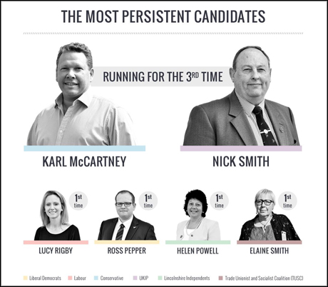
Screengrab from TheLincolnite.co.uk
It may not have the interactive whizz-bang of some features on this list but The Lincolnite's "MP candidates by numbers" deserves a mention for giving a sharp, visual introduction to candidates standing in Lincoln as part of its excellent election hub.
By looking at some of the candidates individual stats like social media presence or "persistence" in standing for election, as well as detailing the electoral history of the area, The Lincolnite proves local news can have brains and beauty without breaking the bank.
Honourable mentions:
- May2015 – Seat calculator
- Trinity Mirror Regionals – Find My Seat
- The Times Red Box – Election dashboard
As well as its e-mail newsletter, The Times Red Box has built a live election monitor outside the normal paywall for results night, with constituency info and special mention of leader parties and battleground seats.
- Local World – General Election Compass
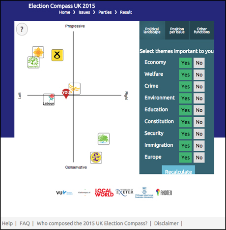
Screengrab from Local World title The Stoke Sentinel
Journalism.co.uk coverage
You didn't think we would leave ourselves out did you? We might not be vox-popping at the polling stations or berating leaders on the battle buses but we tried to include some coverage of tools, tips and advice to help journalists everywhere report on elections.
So check out this podcast on tips for covering elections at local and national levels and these seven data viz tools for election coverage.
Think we missed anything? Let us know in the comments below.
And if you are going to be working the whole night through – eyes bleary and bloodshot, hands shaky from caffeine and exhaustion, turning the newsroom red with rage as Tower Hamlets yet again don't start their count until after breakfast – think of David Dimbleby.
At the grand age of 76 this will be the last time Dimbleby pulls an all-nighter to host the BBC's coverage, a feat he has accomplished with charm at every election since 1979.
David Dimbleby
Update: This article has been updated to clarify how the Tweetometer works and who made the Financial Times coalition calculator
Free daily newsletter
If you like our news and feature articles, you can sign up to receive our free daily (Mon-Fri) email newsletter (mobile friendly).
Related articles
- Livestreaming, explainer videos and newsletters: Overnight election coverage with three new media companies
- How are news organisations covering the UK's general election 2024?
- Sky News and BuzzFeed UK collaborate on livestreaming UK general election 2019 overnight show
- The Ferret launches fact-checking service, aiming to work with its community to verify claims
- 5 experiments in storytelling from Mashable


