


Credit: By Jorge Franganillo on Flickr. Some rights reserved.
Whether the information is found purposefully buried in a huge government release or sought out by Freedom of Information request, data stories are increasingly common in the era of electronic journalism.
Pivot tables are an invaluable tool for finding the story in all that noise. They are especially useful for simplifying large datasets without having to delete other chunks of data.
Essentially a pivot table lets you question the information you have, rather than having to work it all out yourself. Since the ability to quickly sift through figures is paramount for a journalist using data, the ability to create and use a pivot table tool is vital.
The majority of spreadsheet programs have the ability to create pivot tables, so they're extremely easy to practice using. This also allows you to practice cleaning data, which is another invaluable skill and one you'll need before creating pivot tables.
Getting the data
First, however, you'll need to grab some data. As explained here, there are numerous sources for data released by the government or regulatory bodies. For the purposes of this guide, we'll be using this dataset on monthly overseas travel and tourism, which is available from the Office for National Statistics (ONS).
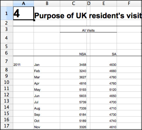
First, select the Table 4 tab at the bottom. This should display 'Purpose of UK resident's visits abroad by month'. Click and drag to select all the data and paste it into a new workbook.
Cleaning the data
This data will now require some cleaning before it can be entered into a pivot table. The important things to note at this point are that when creating a table there must be at least three columns or rows, and that all the data must be contiguous, or touching.
Delete rows 1, 2, 3, 5, 6 and everything after row 43, then delete columns C to F. You should be left with just the data detailing the purpose from 2011 to 2013.
Unfortunately the data still is not contiguous at this point, so scan the columns for any that do not contain any data. In this case, that should be the columns between each 'purpose' entry. Now add 'year' and 'month' labels to the top of the appropriate columns, and copy the correct year down until it reaches the following year.
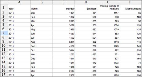
You might think that the data is now contiguous and matching, but unfortunately it requires one last thing: the December entry for 2013 is marked as 'Dec† rather than 'Dec'. Change it to match the other Dec entries, as otherwise it will not be counted among them when filtered.
You also have to change June and July in the 2013 section to match the other years. Minor changes like this are hugely important when it comes to cleaning data for use in pivot tables.
Creating the table
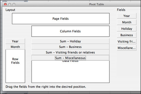
Now, select the data. Using Excel, this is as simple as clicking and dragging over the data. Now select the 'Insert' tab and then 'Pivot Table'. It is best to insert the table into a new document.
On other programs like OpenOffice data or in a Google spreadsheet, you might have to click the 'Data' tab to insert a pivot table. From there, though the interface might be slightly different, the basic functionality is the same.
In Excel or OpenOffice, drag and drop the 'Year' and 'Month' options into the 'Rows' section, and add the remaining options into the 'Data' section. If you're working in a Google spreadsheet you can add the year and month to the rows in the report editor on the right, and put the other options into 'Values'
Now when you create the pivot table, you should be able to use the filter function to sort the individual years and months and receive quick sums of those dates.
For instance, by selecting 'All' under the year filter and 'Jan' and 'Jul' under the Month filter we can quickly see that while the total of British people travelling abroad for Business barely changes between those two months, the amount travelling for Holiday changes frequently rises to nearly four times the amount, and this trend is accurate across each year.
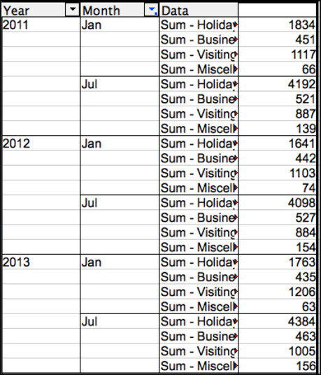
An obvious story, perhaps, but one that demonstrates the ease and versatility of using a pivot table to sort your data. You can also use the data to create charts that will update themselves when you choose different filters, so you can see any dramatic spikes or drops in the numbers even more clearly.
John Burn-Murdoch, data journalist at the Financial Times, will lead a workshop on spreadsheet skills at Journalism.co.uk's forthcoming digital journalism conference news:rewired, on Wednesday 23 July. See the full agenda and ticket information here.
Free daily newsletter
If you like our news and feature articles, you can sign up to receive our free daily (Mon-Fri) email newsletter (mobile friendly).
Related articles
- 12 essential self-taught journalism skills
- "Your reader's trust is something money cannot buy"
- Advertorial: Improving strategic content planning in your newsroom
- James Hewes, CEO of FIPP, on the legacy of the pandemic on digital media
- Elisabeth Gamperl of Süddeutsche Zeitung on metrics anxiety in the newsroom


