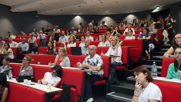
A brand new version of theguardian.com launches today. Wolfgang Blau, director of digital strategy, and creative director Alex Breuer explain the developmental process and some of the key features
Credit: Michael Bruntonspall on Flickr. Some rights reserved
This article was migrated from an old version of our website in 2025. As a result, it might have some low-quality images or non-functioning links - if there's any issues you'd like to see fixed, get in touch with us at info@journalism.co.uk.
The Guardian has today launched its new website after almost a year in beta, showcasing a design which ditches the standard 'print' columnised format and instead takes its lead from the habits and preferences of its digital readers.
As well as the new-look theguardian.com , the back-end of the site has also been redesigned from scratch, with a new streamlined content-management system (CMS) enabling a faster publishing process, as well as better curation and collaboration.
"Our last site was from a time when the majority of readers still didn't use websites as their primary source of news," explained Wolfgang Blau , the Guardian's director of digital strategy, "but that has changed obviously".
The foundations for the new site were laid using insights from the Guardian's in-house analytics platform Ophan into how people were reading its previous site.
Indicators such as eye-tracking and heat maps revealed that the long vertical columns of text, which in a way reflected the layout of the newspaper, were not conducive to an engaging reading experience.
"We felt visually this was a symptom of very repetitive layout forms," said Alex Breuer , creative director at the outlet.
"Everything had a small picture, a headline and piece of text, and so people were visually fatigued or didn't really see the value of what was being presented to them."
The new site went live this morning to the Guardian's audience of 107 million unique monthly visitors , including migrations of the platform to its US and Australian editions.
In conversation with Journalism.co.uk, Blau and Breuer explained some of the key principles behind the redesign.
Every article should be a homepage
One of the most fundamental changes is the new structure of the site.
Columns have been replaced by "containers" – essentially banded sections whose layout and content can be individually configured and replicated to appear anywhere on the Guardian site, be that on the homepage, on another section such as sport, or embedded into individual articles.
"What this allows us to do is keep surprises or vary the visual presentation of each container so it actually reflects the flavour of the content in there," said Breuer.
Containers can be added to single stories, or to many articles at once using a common tag such as "General Election", making it faster and easier for editorial to add related or contextual stories to individual articles for a more engaging reader experience.
"This whole theme of every 'article needs to be a homepage' was of course guiding us, to the point of us realising, 'but what really is a homepage?'" said Blau, referring to the fact that many news sites now receive a large portion of their traffic to individual articles through the 'side door' of social media, rather than direct homepage visits.
However, despite the Guardian's strength on social – it was recently named the most tweeted UK news site of 2014 – Blau noted that a third of all visits to theguardian.com globally still contain a page view of the homepage.
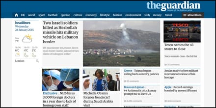
The new-look Guardian homepage (screengrab from theguardian.com)
.
Demonstrate the value of important stories
The new Guardian site introduces a number of new layouts in terms of how large stories can appear within containers, depending on how important they are, by increasing the "volume", or size, of certain stories.
Some sections have more layout options than others – there are more than 60 ways to rearrange the containers for news or sport, for example.
The homepage has also been restructured to deliver present stories more in the way Breuer believes people will want to discover them.
There are now "two or three times" more stories at the top of the homepage, he explained, while the distribution of the big stories of the day has also changed, being "scattered out down the whole scroll of the site" instead of concentrated at the top, as a way of encouraging people to explore the different sections.
Users can also personalise the homepage by choosing to hide or show different site sections depending on their interests, a feature which will already be familiar to users of the Guardian app , which launched last May.
Another crossover from the app is the use of "colour language" which enables users to quickly identify different types of content, for example, red for live blogs and orange for comment pieces.
Make it faster for journalists to publish media-rich stories
The redesigned Guardian CMS is a more streamlined version of its old publishing system, with any unnecessary data fields stripped out.
"What we want to reduce is the amount of emails being sent within the building and across countries – and no more Word files", said Blau. "We want a very pleasant writing experience."
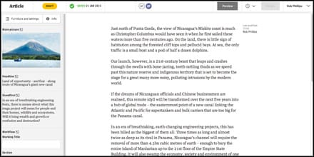
The newly designed Guardian CMS (credit: Guardian Press Office)
The CMS also aims to speed up the time it takes for journalists to publish media rich stories featuring text, images and video.
Journalists can choose from four different images sizes within the article, from thumbnails through to full-width in-line images, and images can now be cropped from directly within the CMS.
Content curated from elsewhere around the web, such as YouTube for example, can be added to a story simply by copying the URL.
The "mobile mindset" is also baked into all of the Guardian's tools, explained Blau, with the CMS offering the ability to preview how stories will appear on smartphones. Another nifty feature shows when the headline currently being written will appear truncated on mobile, if it oversteps 70 characters.
Although the CMS has been built to work on mobile, this has not yet been rolled out to Guardian journalists, with Blau explaining it still requires work to improve the user-experience.
Meanwhile, the addition of a new tool called Workflow has been developed to offer the Guardian's newsdesks "a full overview of what is being currently worked at around the world", said Blau.
Workflow shows editors what stories are being worked on in the CMS as they are being written, enabling them to know the angle a journalist plans to take on a story and pursue any further information that might be needed, as well as removing the risk of doubling up on the same story from two different journalists.
Encourage a more loyal, engaged relationship with readers
A key aim of the Guardian's new site, said Blau, is to achieve "a closer, more regular, more loyal, engaged relationship with our readers".
As well as the more engaging layout and personalised homepage, other new features include breaking news alerts at the bottom of the screen – similar to a mobile push notification – which users can dismiss or click through to the story as they choose.
Comments and discussion threads are also given more space, with a new function in the CMS enabling editors to highlight poignant comments by pulling them above the rest of the thread.
The Guardian's live blog format has also been given a makeover, with the aim of encouraging repeat visits.
While the outlet, along with many other sites, has adopted the use of bullet points near the top of live blogs to summarise the key points, it has taken this functionality up a notch by differentiating between new and repeat visitors.
Now, a reader who comes back to the same live blog more than once within the same day will also see a bulleted summary of 'what just happened' summarising key events since their last visit.
"Before we had that [feature]," said Breuer, "our live blogs – like Twitter – were quite stressful. You wonder, if you don't go further down, what you might have missed.
"By simply adding that elegant 10-point navigation you arrive and quickly scroll through that and feel, 'Okay, I don't have to hang about'."
Openness and transparency
Around this time last year the Guardian took the unusual step of launching "a very early iteration" of its site and sending 5 per cent of its global desktop traffic to it, explained Blau.
"Of course our most loyal readers said, 'You've got to be kidding'," he added. "And even internally – you can tell people this is not [the finished version] but sometimes you have to test really extreme iterations or design assumptions before you completely tone it down again."
However, he believes that opening up the process of the new site was crucial to its development.
The code for the site and the results of AB testing were also shared on GitHub, while the outlet embarked on an enormous feedback project through meeting readers in person and conducting on-site surveys. It has received 130,000 pieces of user feedback so far.
This feedback is ongoing. With the new navigation, for example, some users have said they found it difficult to locate their favourite sections – so Blau and Breuer are now experimenting with the first iteration of a personalised navigation system featuring a user's most recently visited sections of the site.