


Credit: Image by TapiF on Flickr. Some rights reserved
Over the past year here at Journalism.co.uk we have reported on a number of new tools and platforms which have been launched or updated, which offer journalists different ways of telling stories visually.
Our news:rewired events have also highlighted a number of those tools, most recently in a dedicated session on visual storytelling at news:rewired - digital stories, which was held last Thursday (6 December).
Here is a list of just 14 tools that journalists might find useful. Some launched this year, while others have been around for some time now but continue to be used by news outlets today.
Timelines
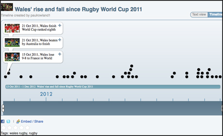
1. Timetoast
Users simply sign up to Timetoast and then they can create embeddable timelines.
Each event added to the timeline can have an image and link added to it. Timelines can be saved as drafts until ready to be published, at which point they can be customised and embedded into news sites. The timelines can be viewed as a table or in timeline format and the final timeline is also given its own URL for direct linking.
At news:rewired last week Paul Rowland, deputy head of content (digital), Media Wales, recommended using Timetoast to build timelines, showing one he created on "Wales' rise and fall since Rugby World Cup 2011" as an example of the tool in use.
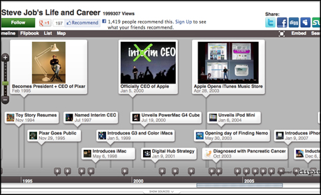
2. Dipity
Another timeline building option is Dipity, which users also sign up to use, either directly through Dipity or via Facebook.
Like Timetoast each event added to the timeline can be given an image and link, as well as a location and video URL.
Users can also set up searches of sites such as Twitter, Flickr, YouTube and Google News from within Dipity, which will then add a selection of the most recent content from specific users or based on keywords, to the timeline.
Searches can also be set up such as for photos from Flickr and Picasa users or videos from YouTube or Vimeo users. Users can also add content via an RSS feed.
Dipity timelines can be viewed in either a list, flipboard, map or timeline format.
Data visualisations
3. Google Fusion Tables
Google Fusion Tables are used by many news outlets to build data visualisations. Fusion Tables enables users to transform data into visualisations such as charts and maps, which can then be embedded into news sites. Users can also combine data sets.
In this post from last year on Journalism.co.uk we look at "five great examples of data journalism using Google Fusion Tables".
There is also a detailed how-to guide on getting to grips with Google Fusion Tables for the first time. And this guide from Poynter covers how to produce heat maps in particular.
And Google also provides its own tutorials on using the platform.
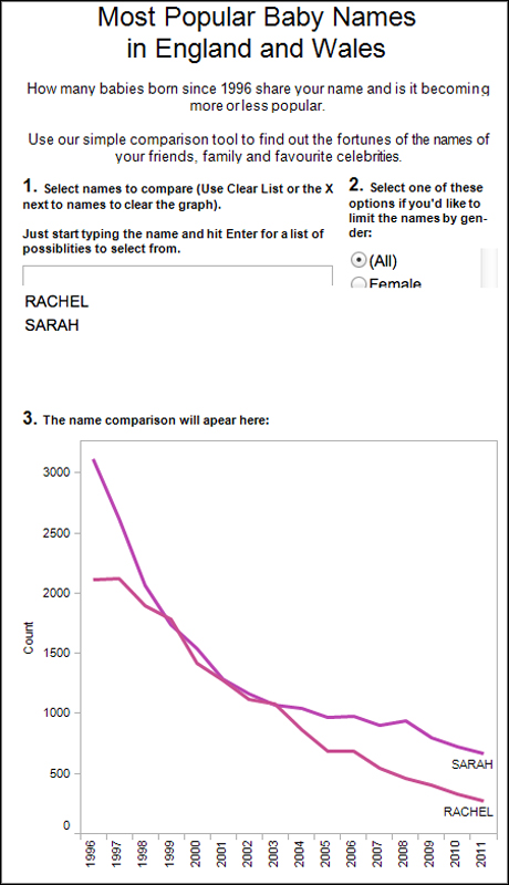
4. Tableau
Tableau Public is a data visualisations platform which can be used to make interactive graphs and maps. The resulting visualisations can then be embedded onto a news site. The end visualisations can also be manipulated by the viewer.
According to Tableau, it's Public software "offers hundreds of visualisation types", and its mapping technology "automatically geocodes down to the city and zip code level".
Tableau, which has been used by a number of news outlets including the Guardian and New Scientist, explains how to use the tool in more detail at this link.
And at news:rewired last week, Media Wales's Paul Rowland showed an example of how the news outlet also used the technology to create an interactive which enabled readers to compare the popularity of baby names, and produce a graph based on the names entered.
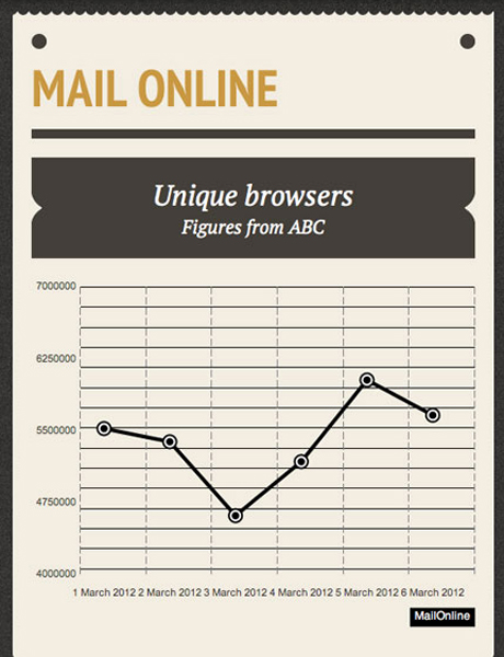
5. Datawrapper
Datawrapper was one tool recommended by data journalist Nicolas Kayser-Bril during his keynote speech at news:rewired - digital stories last week. He worked on the the development and design of the tool, according to the Datawrapper site.
It is a free, open-source, data visualisation tool which produces graph or pie chart style visualisations. Data can be copied in from either Excel, a Google document or a web page, according to the website.
The site adds that users can also opt to use Datawrapper's hosted service or install it onto their own servers.
Below is a copy of a chart based on a study by Rippla on news articles shared on Twitter.

Multimedia packages
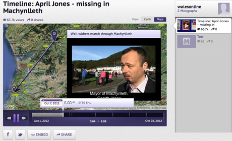
6. Meograph
Meograph, which launched earlier this year, enables users to build embeddable multimedia stories which can include both a timeline of events, as well as geographic representation on a map.
The tool lets journalists create "moments", which are they key parts of a story, and can include a range of multimedia content such as images, YouTube videos and links to outside articles and wider content. These can then plotted on a timeline and map, with audio overlay for a narrative if required.
The platform also recently launched an update which means plotting the location of a 'moment' is now optional, to help journalists use the tool to cover a wider range of stories.
At news:rewired Media Wales's Paul Rowland showed an example Meograph which the news outlet produced to report on the April Jones case.
7. Storify
Storify is a digital publishing tool which enables journalists to drag and drop in media from across the web, such as tweets, URLs, YouTube videos and Flickr images to create a multimedia-rich story which can then be embedded into a news site.
There are an additional array of sources users can add in to a Storify, such as SoundCloud audio, updates from App.net, RSS feeds, Tumblr blogs and Disqus comments.
Journalism.co.uk recently built a Storify as a way of covering its news:rewired digital journalism conference, by compiling tweets, photos, video, tweets and links to coverage.
8. Storination
Storination is a platform which enables users to create a group of Storify stories. Publishers could use it to group together Storify stories from a certain event, for example, or covering a specific subject.
The tool is free to use, but there is a cost for sites or brands to use the white label option which launched in private beta earlier this year.
9. Popcorn Maker
Popcorn Maker was released by Mozilla earlier this year, as a tool which helps journalists add context by overlaying additional content to video or audio.
The first version of Popcorn Maker lets users place tweets, maps, links to other web content and images on top of video from YouTube or Vimeo, or audio from SoundCloud. The original media file – whether video or audio – is added to Popcorn Maker by pasting in the URL.
Different map types are available – such as Google maps terrain, satellite, as well as street view – as well as the Stamen maps. Mozilla has more on how maps in particular can be used in Popcorn Maker.
The end product can then be embedded into a news site. And as the Mozilla Hacks blog explained at the time of launch, there is also a "remix" button which enables "anyone watching to become a creator themselves by using the current remix as a base project for their own creation".
This example shows how Popcorn Maker was used to add to a video of a talk at the TED conference.
There is also a Javascript library called Popcorn.js which coders can use to create videos. Popcorn.js was, for example, used to create this visualisation at the BBC to illustrate the last movements of Ian Tomlinson.
There is an tutorial which lets you create the BBC visualisation using Popcorn Maker at this link.
10. Cowbird
Cowbird aims to be the "world's simplest and most beautiful storytelling tools", and enables users to create multimedia stories with audio, images, text and other features.
An early use case was by National Geographic which used the platform to collect together the stories – through images and text – of those living in the Pine Ridge Indian Reservation.
Another interesting use case, as highlighted by Columbia Journalism Review, was by photojournalist Sebastian Meyer who used the platform to "tell short reported stories that were too small to sell to a client".
In his example of "The day the bomb dropped", Meyer added audio to help demonstrate time, the CJR report adds.
Interactive images
11. ThingLink
ThingLink offers the ability to make images interactive by adding points to a still image and attaching links, such as to other content, multimedia or social media pages.
The 10,000 Words blog recently produced a post suggesting "five ideas for ThinkLinked journalism", such as producing timelines, maps users can interact with or inforgraphics.
Creative director of ThingLink Jonas Forth spoke at Journalism.co.uk's news:rewired conference last week, of which ThingLink was a sponsor.
In his presentation, which can be seen at this link, Forth outlined the different ways news outlets have already been using the platform, including use cases by the Guardian, the Washington Post, the Montreal Gazette, Mashable the Huffington Post and NME.
ThingLink images can also now be added to Storify packages.
ThingLink is free for editorial use. At news:rewired Media Wales's Paul Rowland also showed an example of how the news outlet used ThingLink to allow users to "explore how the search for April Jones has unfolded".
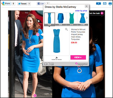
12. Taggstar
Taggstar similarly enables images to be made interactive by adding links to content such as video, audio and text, as well as external websites.
According to TechCrunch, "it’s the e-commerce angle that will likely interest publishers the most", with Taggstar, with the ability to make images "shoppable" with links to products. The example below from MSN shows one way this can be achieved.
Infographics
13. Visual.ly
Visual.ly currently offers a sample of free infographics which journalists can create based on certain data entered, such as a hashtag or Twitter accounts. The platform told Journalism.co.uk earlier this year it was planning on launching more tools to create infographics soon.
Samples currently available include "the life of a hashtag" or a visualisation of a Facebook page.
Visual.ly has also launched a product in private alpha which lets users create their own charts and graphs, and which has been tested with outlets including the Huffington Post, CNN, and the Economist.
14. Infogr.am
Infogr.am launched earlier this year and enables users to choose from a number of infographic templates to then apply their own data, text, charts and images.
There are currently six different infographic templates for users to choose from, which feature "dummy" data and text to help guide users. The site also enables users to create charts, choosing from 12 different options of chart type, before uploading the data to customise.
The layout of the infographics can also be customised using drag-and-drop movements, and the end result is then embeddable.
Below is a copy of a test Infogram we produced earlier in the year:
To tell us about a visual storytelling tool you find useful, leave us a comment below.
Free daily newsletter
If you like our news and feature articles, you can sign up to receive our free daily (Mon-Fri) email newsletter (mobile friendly).


