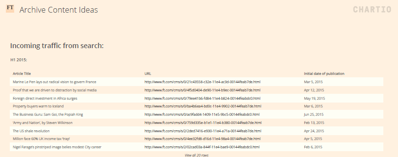
A new dashboard from the FT helps editors identify and promote relevant archive stories
The dashboard, created in-house by the Financial Times using Chartio, shows editors which older articles are popular with readers and if they are being found through search, social media or internally
This article was migrated from an old version of our website in 2025. As a result, it might have some low-quality images or non-functioning links - if there's any issues you'd like to see fixed, get in touch with us at info@journalism.co.uk.
The Financial Times has developed a new dashboard that allows journalists to identify which stories from the archive are popular with readers again, and re-promote them on social media.
The dashboard launched in August and has been rolled out to the FT's global social media teams in the past few weeks. It has been built using a platform called Chartio, and shows which archival content has seen an increase in traffic over the previous two weeks, and whether readers are coming to those stories through search, social media or by clicking through from articles posted on ft.com.
"Part of the idea was to have a system in place for how we use older content," Jake Grovum, US social media editor at the FT, told Journalism.co.uk. "Before this, it was done ad-hoc if something was in the news.
"This is a way to have that content re-surfaced for us and a way to be alerted that something is of interest, so we can re-promote it and let people know we have a story on a particular topic and they might be interested in it because it's back in the news."
Some of the stories flagged by the dashboard are evergreen, such as this comment piece about the death of the 40-hour work week, which Grovum said has remained "as relevant and timely" as when it was first published.
Other articles that are more tied to the news cycle, for example an interview with a key political figure like Marine Le Pen, would be labelled as archival content when re-promoted on social media, to avoid misleading the audience into thinking the story is new.
Screenshot from Chartio. Image courtesy of the FT
On average, the articles flagged by the tool and re-promoted have seen more engagement than the FT's average Facebook posts, getting three times more clicks. They have also performed better than archival content shared by editors without using the dashboard, receiving between 1.5 and 1.7 more clicks on average, as well as more shares and comments.
A spokesperson for the FT also told Journalism.co.uk in an email that most FT articles get 90 per cent of their page views within the first 48 hours after being posted, and re-promoting them at a later date is a way to "give them a second life". The article about the 40-hour work week received 70 per cent of its total page views after the FT shared it again on Facebook on 7 February.
As the dashboard is set up to differentiate between the three sources of traffic (search, social and internal), the reasons why a particular article makes the trending list vary. In the tool's search section, the content of which Grovum said "somewhat mirrors Google Trends", many of the stories relate to consumer companies people look up online.
An increase in internal traffic can come from a big story on the homepage with embedded links, while in the social media section, an uptick in traffic could mean an individual or a group of people with a considerable follower base on Twitter for example have come across a piece and shared it from their accounts.
One other reason is a story's life cycle, said Alyssa Zeisler, engagement strategist at the FT, who built the dashboard.
"I noticed that as business school applications open, a lot of our MBA content will resurface, as people try to figure out where they should apply."
So far, the dashboard, which uses the same data source as the FT's in-house analytics platform Lantern, has only been looking at content published in 2015 and 2016. However, since the tool has performed well and is starting to be used by social media teams on different desks to target specific audience segments, Zeisler hopes to expand the time frame and include content published before 2015 as well.
"Based on its success, I am now working with the data team to do a larger investigation into our archival and evergreen content to see what other utility we might get from it.
"Some of the evergreen pieces people are constantly interested in and those will always do well, so is there a way to use those pieces the dashboard pulls up to create a sort of predictive model about what might do well or not?
"It's part of our larger strategy of being audience-first," Zeisler said, "so we are taking what our readers are telling us and using it to highlight what we could be doing."
Correction 16 February 2017: This article has been edited to clarify the FT did not build Chartio, but rather a new dashboard using an existing, third party service called Chartio.