


Credit: luc legay on Flickr. Some rights reserved
Data visualisations are a compelling way to present data-driven stories, but often they only show 'what' is happening in a story, rather than 'why' it is happening.
Tableau's Story Points launched last year, allowing users to create a narrative or to offer analysis as they walk readers through sequential presentations from a specific dataset.
Story Points has been used by outlets such as CNBC in this interactive data timeline of the companies that have entered and left the iconic Dow Jones Industrial Average over the past 87 years.
The following guide was put together using Tableau Public 8.3 for Mac following instruction from Sophie Sparkes, data analyst at Tableau.
1. To create a story, download Tableau Public and create an account, if you haven't already. The software is free and the download should not take longer than a couple of minutes. While it's downloading, you could check out Tableau's Viz of the Day for inspiration.
2. Get hold of a data source. For this example, I'm using sample data from the World DataBank Indicators 2010.
Tableau Public will only connect to text files such as Microsoft Excel, Microsoft Access or CSV files. The limit for a single text file is 1,000,000 rows of data.
Your data source should be laid out in the standard format where each row is a data point and each column is a description of that data point. If necessary, you can clean up your dataset in Tableau or in Excel – here's a post from Paul Bradshaw's Online Journalism Blog on how to clean data using Google Refine.
3. Launch Tableau Public and load your data by dragging and dropping the file over the orange 'open data' button. The larger your dataset, the longer it will take to load. Once the file has loaded, Tableau will automatically open a new workbook.
If you're using an Excel spreadsheet which has multiple worksheets, they will appear as a list in your workbook. CSV files are obviously just one sheet. Add the data sheets you want to work on by dragging and dropping them into the large white box to the left of your data sheets. As you do this you'll see a preview of your sheets, which is useful to check if everything appears as you would expect.
At this point you can also do a basic clean of your data in the preview area by clicking the dropdown arrow that appears when you hover over a column, and choosing to either hide or rename that column.
When you are ready, click the orange 'go to worksheet' button.
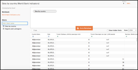
Adding data sheets to the workbook (screenshot from Tableau Public)
4. Tableau automatically creates categories from your data, so anything with a little blue 'ABC' symbol next to it has been recognised as a text string, while the green hashtags are used for numerical data, a globe would denote a geographic location and a calendar symbol is used for dates.
If Tableau has categorised something incorrectly, you can change it by control-clicking on the symbol next to the data point and selecting either 'change data type' or 'convert to measure'.
Tableau sorts data points into 'dimensions' and 'measures'. A dimension is a discreet data point – things like text fields, dates and countries – while measures are continuous and numeric, so in this case, Gross Domestic Product (GDP), birth rate, population ages etc. Tableau also generates a couple of things automatically, such as the latitude and longitude of any geographical locations.
5. Now we need to create the worksheets that will make up our Story. For demonstration purposes I'm going to create three worksheets but you can create as many as you like. I'm going to whizz through the steps to create a Tableau visualisation fairly quickly, but if you'd like more details on how to do this there are training tutorials on the Tableau website.
Select a data point, for example, country name. The 'show me' toolbar to the right of your screen will then highlight the types of visualisations you can do with that data point, such as create maps, pie charts or line graphs.
6. To add more information when you hover over the datapoints on your visualisation, you can add a 'tooltip'. To do that, drag a datapoint onto the 'tooltip' button in the 'marks' section. You can also use these markers to determine the colours, labels and, in my example, the size of the bubbles that appear as markers on my map.
For my first datasheet showing the number of mobile phone subscribers by country I chose the 'packed bubbles' visualisation, where the size of the bubbles is determined by the number of subscribers. To do this, I dragged that datapoint over the 'size' button in the 'marks' menu, then dragged 'country name' over colour to distinguish the bubbles and create a visually engaging effect.
I added further detail by dragging both 'country name' and 'number of mobile phone subscribers' over the 'label' button, and added information about total population and urban population to the tooltip. This information becomes visible when someone hovers over the bubble.
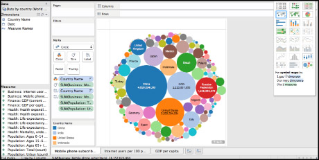
Data visualisation in progress in the worksheet (screenshot from Tableau Public)
7. You may have some points in your dataset which are null values and classified as 'unknown'. This means there is something in there that Tableau doesn't understand. In this case you can have a look to see if it is something obvious, like a misspelling, that's causing the problem, or something else. There are a couple of different ways to handle null values, outlined in this article here.
You can create more visualisations by adding more sheets to your dashboard. Just click the icon with the tiny plus sign and bar chart next to 'sheet one' towards the bottom of your screen.
8. When you're happy with your visualisations, go to 'story' in the top navigation bar, and select 'new story'. Then drag the sheet you want to appear as your first story point onto the canvas.
Give your story a title and add a short caption by clicking within the respective text areas. You can also add more context to your visualisation by dragging the 'description' box from the left sidebar onto your canvas. The description box accepts text formatting and hyperlinks.
The default size for Story Points is 1016 x 965 pixels, although if you wish you can adjust the size of your canvas using the dimensions toolbox at the bottom of the left sidebar.
Story Points allows you to save different stages of your visualisation, in case you want to refer back to them later, simply by clicking the orange 'update' text above the canvas.
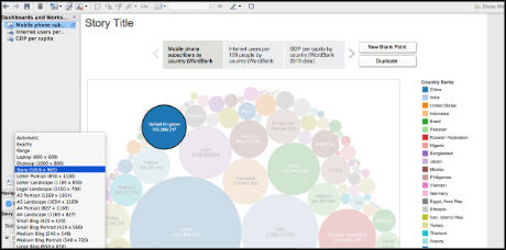
Adjusting the dimensions of a visualisation in Story Points (screenshot from Tableau Public)
You can add another sheet to your story by clicking the 'new blank point' button above the canvas, or click 'duplicate' to copy the story point you already have.
Continue adding points to your story until you have added all the worksheets you want to use.
9. Once you're ready to save your story, go to 'file' and 'save to web as' in the top navigation bar. Your Story Points will then be published to the Tableau Public site. With Tableau Public, users can only save their work publicly online – it is not possible to save it privately or download it to your computer (to do that, you need Tableau Desktop, which is a paid-for service).
Bear in mind too that anything saved to Tableau Public is accessible to everyone – other users can not only view your visualisations and Story Points but also download a copy of your workbook and underlying data. Although this makes Tableau Public great for collaboration, as other users can work with your data to extend your original visualisations, it is important not to use Tableau Public for working with data which may be sensitive or should otherwise be kept private.
10. To view your Story Points, go to the Tableau Public website and log in. From here you can grab an embed code for your blog or site, or download your visualisations as an image, PDF or Tableau workbook. You can see my finished Story Points here.
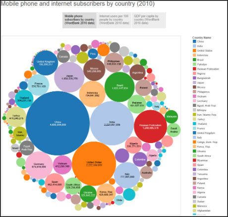
The finished Story Points on Tableau Public
Update 11.05.15: Tableau Public this week made pro features available to all users, including the ability to add up to 10 million data rows, limit file downloads and increase storage.
Free daily newsletter
If you like our news and feature articles, you can sign up to receive our free daily (Mon-Fri) email newsletter (mobile friendly).
Related articles
- Meet the inspiring, disabled journalists working their dream jobs
- Shaping the future of journalism: insights for the next generation
- New free course on war reporting launched
- Solutions journalism superstars: media mentor and trainer, Swati Sanyal Tarafdar
- Preethi Nallu, global director, Report for the World, on strengthening media ecosystems


