Tips for creating personalised interactives from #ONA16
Experts from New York Daily News and CUNY shared advice on producing interactives at the ONA conference in Denver
– 3 min read
Experts from New York Daily News and CUNY shared advice on producing interactives at the ONA conference in Denver
This article was migrated from an old version of our website in 2025. As a result, it might have some low-quality images or non-functioning links - if there's any issues you'd like to see fixed, get in touch with us at info@journalism.co.uk.
Storytelling with personalised interactives is a great way to show readers how stories and data personally affects them.
The Wall Street Journal's What's Your Pay Gap?, for example, allows people to enter their profession and see how average earnings differ between men and women.
On a lighter note, The New York Times' Olympic Races, In Your Neighborhood maps out races depending on a given address.
The idea is to offer people "a perspective they may not have had before," explained Sandeep Junnarkar, director of interactive journalism at CUNY, speaking at the ONA conference in Denver.
Below are some tips for creating your own interactives from CUNY and New York Daily News.
An interactive does not have to be complex to be effective. It should be easy to use, with simple wording to guide the reader – who should be able to answer these questions off the top of his or her head in a matter of minutes.
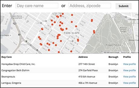
An interactive produced by New York Daily News on the safety of day care centres, for example, required users to simply enter their zip code to see centres and safety violations in their area – information which had previously been difficult for parents to find online.
"I think sometimes simple is really effective and in this case we offered a really important service to New York City parents," said Kristen Lee, director of digital editorial operations at the Daily News.
A good interactive allows people to learn about their own situation, or the situation of others, and gives them information that will be of use to them in some form.
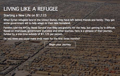
The CUNY project Living Like A Refugee allows people to "experience" life as a displaced person starting a new life in America.
Users must decide how they will spend their one-off government subsidy of $1,125 per person, for example, on education, job hunting, and other means to get back on their feet.
The idea was to offer people "a sense of what it was like to take that journey," explained Junnarkar.
Thorough reporting will ensure your interactive is accurate and increase its chances for resonating with people.
For CUNY's refugee interactive, data was collected from multiple sources such as real estate listings and schooling costs, as well as interviews with refugees in Michigan and San Diego.
Lee also recommended "reaching out to your readers too for their stories and for their data".
Junnarkar recommended creating a paper prototype for your interactive, almost like a storyboard.
Sketching out plans is not something that should be rushed, and will help to ensure time is not wasted later on.
At CUNY, Junnarkar and Jere Hester, director of news products and projects, map out interactives using post-it notes stuck to an office window, so they can easily be reshuffled as paths inevitably change.
Smaller newsrooms might feel intimidated by the prospect of creating a resource-heavy interactive, but Lee pointed out forming partnerships is one way to reduce the burden and share costs.
New York Daily News has partnered with sites such as ProPublica to get data for interactive stories.
Never underestimate the power of testing your interactive with different groups of people before it goes live.
New York Daily News asked parents in the newsroom to try out its day care safety interactive, and used feedback to fix any aspects that were unclear.
"People are always going to have their own perspective," said Hester.
"All these things that you're thinking of, or that you may not be thinking of, other people will tell you."