How to map connections between individuals, companies and more with VIS
Working on a complex story or investigation involving multiple entities? Use this free tool to show how they relate
– 3 min read
Working on a complex story or investigation involving multiple entities? Use this free tool to show how they relate

This article was migrated from an old version of our website in 2025. As a result, it might have some low-quality images or non-functioning links - if there's any issues you'd like to see fixed, get in touch with us at info@journalism.co.uk.
What is it? A tool for mapping the connections between people, companies and other entitities involved in an investigation.
Cost: Free
How is it of use to journalists:
Investigative reporting such as the stories that have come out of the Panama Papers database in the last year are often complex, involving multiple characters, organisations and even borders, so it's important for journalists to highlight the relationships between them and the role each element has.
With Visual Investigative Scenarios (VIS), reporters can illustrate these connections by creating visualisations that can be included as static images, or embedded into a story to allow readers to follow the threads.
VIS has been created by the Organised Crime and Corruption Reporting Project (OCCRP), who also developed the Investigative Dashboard, with non-profit organisation RISE Project and design agency Quickdata. It is currently available in open beta, so get in touch with the team to report any bugs or suggest features.
How it works:
Get started by creating a free account on the VIS website. When you log in, you will be able to choose from two types of visualisations you can create: metro and geo. The difference is that the 'geo' option uses a Google Map as a background, which can be useful if precise locations are of particular importance in your investigation.
Tap the '+' button in the bottom left corner to start adding elements to your canvas, such as people, businesses, lawsuits, government institutions or assets. For each entity added, there are four steps the tool will take you through.
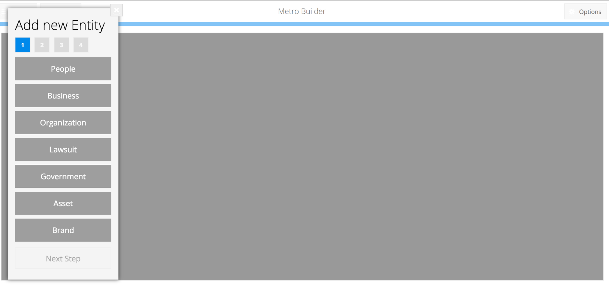
For example if it's a person, you will have to state whether they are a main person or a proxy, before providing optional details like their name, nationality, date of birth or relevant links. Businesses on the other hand can be regular companies, offshore or banks.
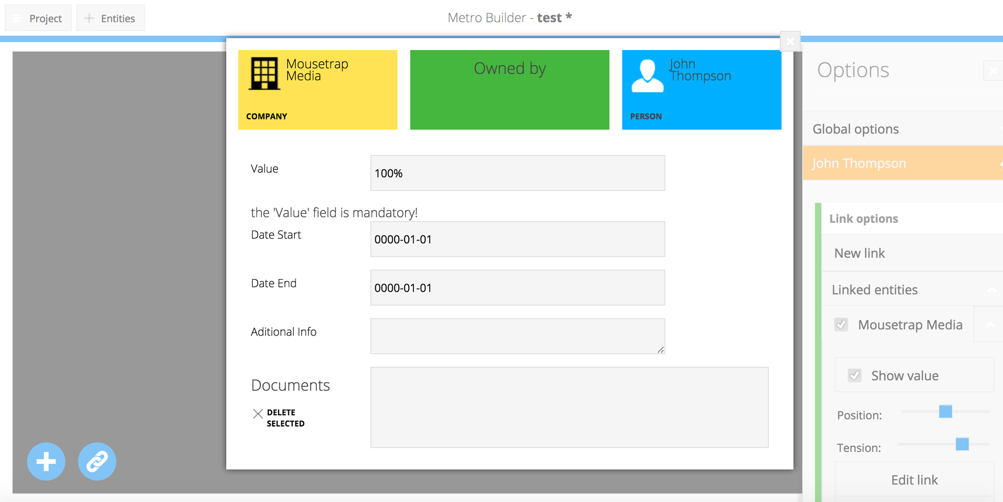
Once all the details have been included, click 'add entity' and the element will appear on the canvas. It can be further personalised using the options menu on the right to change the position of the text, expand or collapse it, or link it to another element.
To create a connection between two elements, such as a person and an organisation, select one of them, click the red linking icon at the bottom left and then click the entity you wish to connect it to. A window will open showing potential connections which can be selected from a drop down menu, such as 'employee', 'owner', 'owes money', depending on which entities you are choosing to relate.
You can also add a value to the connection by filling in the value field, for example typing in '100%' if a company is fully owned by a person, or 'two years' if that is the length of time an asset has belonged to an organisation.
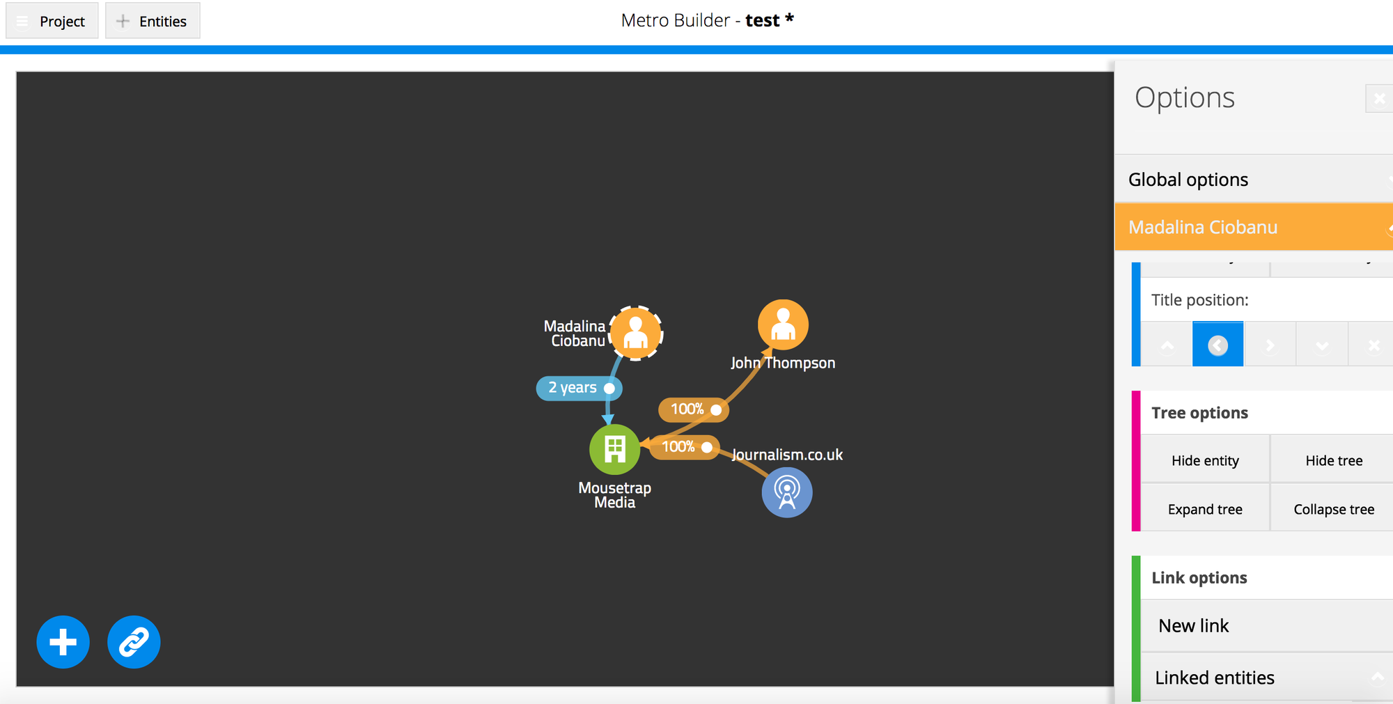
When you have included all the relevant elements and how they are connected, it should look something like this:
Click the 'project' button at the top left to save your layout. You will then be able to change the theme of your visualisation to make it more appealing.
Lastly, click 'export layout' to get the embed code for your VIS and tailor the size to your website's specifications, or 'export image' to get a custom size PNG or JPEG version to use in your story (this feature is fully functional only in Google Chrome browsers). And if you need inspiration, or want to see how others have used the tool, check out the VIS public gallery for examples.
Tell us what you think of VIS by tweeting us @journalismnews and let us know if you know of other tools for making similar visualisations.