Data visualisation tips from Information is Beautiful
David McCandless shares how journalists can 'add a bit of punch' to stories using data visualisation
– 2 min read
David McCandless shares how journalists can 'add a bit of punch' to stories using data visualisation
This article was migrated from an old version of our website in 2025. As a result, it might have some low-quality images or non-functioning links - if there's any issues you'd like to see fixed, get in touch with us at info@journalism.co.uk.
"One of the potentials of [data] visualisation is to bring the data down to earth," according to David McCandless, founder of Information is Beautiful .
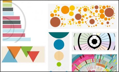
The author of two books on data visualisations, he has created more than 500 diagrams, infographics and interactives, from the 500 most-used passwords to scientific evidence for popular health supplements .
Speaking at yesterday's Collision conference in Las Vegas, McCandless noted the "design bar" in today's culture has risen massively.
"Anything you create visually has to compete with everything everybody has seen before," he said. "So visualisation is growing, and it can add a bit of punch."
Below are some of his tips for producing data visualisations that do just that.
Often the most interesting stories are not in the data itself, but "in the gaps, in the links, in the connections, and in the patterns," said McCandless.
For example, this ' Billion Dollar Gram' visualisation from 2009 shows the cost of everything from the 'worst case total cost of the financial crisis to the US government' ($7,800bn) to the estimates cost of the Iraq war ($3,000bn). One of the starkest connections disclosed the amount of 'foreign aid given by the world's major nations' ($103bn) is roughly the same as the internet porn industry ($97bn).
"You can see patterns and connections and links between data points that would otherwise be scattered across multiple sources that you'd never see together," he added.
For topics that may be a little on the dry side, visualisations can add colour in more ways than one.
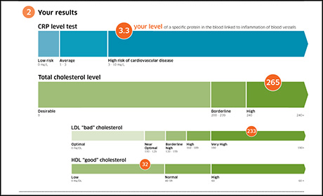
The visualisation of blood test data below – a winning design in a competition held by Wired US – is far more engaging than the same data might have been in a written format, for example.
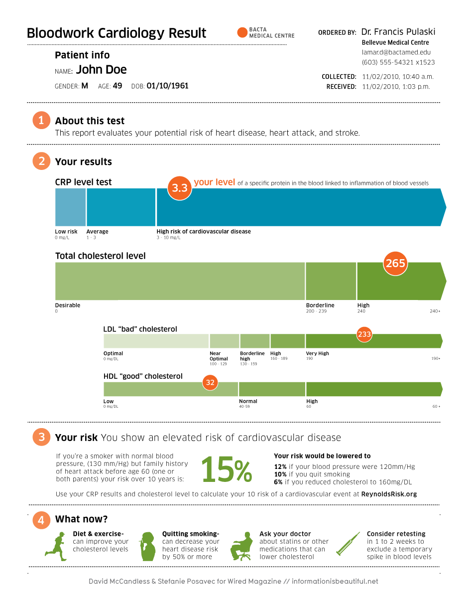
'Bloodwork Cardiology Result' by Information is Beautiful. Click to see the full image.
"We brought visualisation to this to make it appeal to the patient, and the clinician and the doctor," said McCandless.
"So we introduced hierarchy, colour, context, pictograms... it's a great way of lifting your content."
"A lot of our data is quantified data," said McCandless, "but you can also visualise qualitative data.
"People's opinions, sentiment, ideas are things that lend themselves to visualisation as well."
Take a look at this text graphic on good relationship advice or this clever mash-up of drug use figures and world happiness ratings as examples.
There are two core elements to what makes a visualisation really work, said McCandless.
While data and information are of course essential, he argued that "story and message or goal or purpose" is of equal importance.
"The data makes it trustworthy, the story makes it interesting, the goal makes it efficient, and visualisation makes it impactful," said McCandless.
"Combine them together, and you get a successful visualisation."
