Tool for journalists: Atlas from Quartz, for building charts
Browse charts and data from Quartz and create your own visualisations with this free platform
– 3 min read
Browse charts and data from Quartz and create your own visualisations with this free platform
This article was migrated from an old version of our website in 2025. As a result, it might have some low-quality images or non-functioning links - if there's any issues you'd like to see fixed, get in touch with us at info@journalism.co.uk.
What is it? Atlas is Quartz's platform for creating and hosting charts – on 10 May, Quartz started opening it to other journalists working with data.
How is it of use to journalists? If you are just starting out in data journalism, or if you are on the lookout for new data visualisation platforms, Atlas is a great tool to have in your kit.
For starters, you can access many of the charts the Quartz team has put together, as well as the data sets behind them. For a beginner, this is of great help when figuring out the best ways to illustrate particular datasets, and working out the best ways to organise data.
The folks at Storybench, the digital storytelling site from the media innovation programme at Northeastern University, already put some graphs and the data behind them side by side to highlight how you should organise your datasets to get charts the Quartz way.
The Atlas release on 10 May also includes access to Chartbuilder, the open-source data visualisation tool from Quartz – making Atlas a platform where you can both check out new charts from Quartz and create your own data visualisations.
How does it work? As it is still early days for Atlas, all new accounts have to be approved by the team before users can start creating their own charts. But once you're in, the process is simple. Click the plus sign in the top right-hand corner to start building your data visualisation.
If you have used Chartbuilder before, you will be greeted by a familiar interface.
If you haven't, don't worry – it's all rather intuitive.
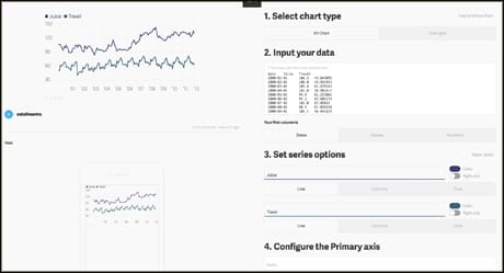
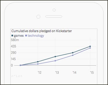
To demonstrate how to use the Chartbuilder section, we are recreating this chart by Quartz reporter Joon Ian Wong, using the source data for "cumulative dollars pledged on Kickstarter" for games and technology projects between 2011-2015.
There are seven steps to follow. After deciding what type of chart you are after, copy your data from the spreadsheet and tell Chartbuilder what your first column includes – dates, names or numbers.
If the data is not organised correctly, error messages pointing out the issues will pop up under the data box.
Once the dataset is in, there will be different editing options for each elements of the chart – in this case, we are creating a line chart, so we can pick the colour of each line on the chart.
Next, Atlas will prompt you to configure the primary axis, adding a prefix or a suffix, and setting up the minimum and maximum numbers to display. You can change the maximum by clicking in the box and then dragging the cursor left if you'd like to decrease the number, and right if you'd like to increase. The axis should start at 0.
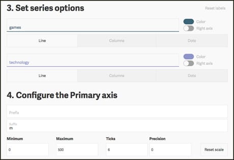
We also need to add 'm' as the suffix, to indicate the numbers on the primary axis represent millions.
You can then change the formatting of the bottom axis, for example whether we want the years to be written as 2015 or '15.
Next, you can give your chart a title, a credit, point to the source data, add tags and a description.
Atlas also has a useful mobile preview – as more people read stories on mobile phones, making data visualisations that work on mobile can be a challenge. This part enables you to make any changes to your chart to make it more mobile-friendly.
Once you're happy with your chart, save it and generate an embed code for your site – note that others will be able to access your source data.