Personalisation and engagement key in NYTimes.com revamp
The New York Times website will be relaunched with new features tomorrow, providing customisation to the reader and flexibility to the organisation
– 4 min read
The New York Times website will be relaunched with new features tomorrow, providing customisation to the reader and flexibility to the organisation

This article was migrated from an old version of our website in 2025. As a result, it might have some low-quality images or non-functioning links - if there's any issues you'd like to see fixed, get in touch with us at info@journalism.co.uk.
The New York Times will relaunch its website tomorrow with a range of new features to bring it up to date with changes at the organisation and the wider digital landscape.
Breaking news notifications, a new comment experience and improved navigation will feature alongside a more visual focus, with further elements of personalisation in the pipeline, while the back end of the site has been restructured to make it more flexible to technological developments in the future.
"The last time the site was redesigned was April 2006 and a lot has changed in the world since then," Denise Warren, executive vice president of the New York Times's digital products and services group, told Journalism.co.uk. "Most notably, tablets weren't around so obviously something that speaks to a touch-enabled world was something that was very much on our mind.
"And our pay model. We were not a paid site back in 2006 and engagement with our content has become much more of a focus for us, unlike sites that are really just trying to churn out page views. Those two things were at the front of our mind. Our goal is to create a cleaner, more engaging experience."
While the homepage will remain largely the same, significant changes will be occurring on article and story pages, she said.
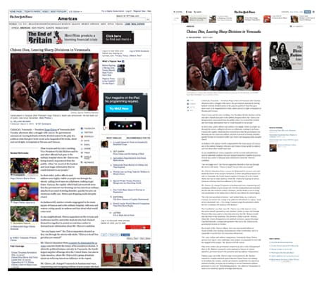
A NYTimes.com article in its current guise (left) and how it will look on the redesigned site
"Multimedia has become much more important in the way we tell out stories," Ian Adelman, the New York Times's director of digital design, told Journalism.co.uk, "and has evolved so much since 2006, so the redesign helps us to showcase the assets in a much better way. The hero in the article will be the photo or video."
This increased visual element will sit alongside a number of changes in how the reader engages with NYTimes.com and vice versa.
We'll be able to message users on everything from their subscriber accounts to breaking news alerts and everything in between - Ian Adelman, the New York Times
At present, the only way readers will know if there has been a breaking news alert is if they return to and refresh the homepage, explained Adelman, unlike push notifications or alerts on mobile devices.
Therefore a new feature on the site will enable NYTimes.com to send messages to readers directly in the site.
"When you're on a given story page and there's a breaking news alert you'll get a little push down message," Adelman said, "subtle enough to not disturb your reading but presented so you can catch up on things and follow the story.
"We'll be able to message users on everything from their subscriber accounts to breaking news alerts and everything in-between."
Comments are getting an overhaul, following last year's experiments which introduced comments in line with the story .
In the initial trials, selected comments were elevated from below the article to provide additional voices to the story, but the redesign will let readers comment directly beside the article.
"You had to work really hard, prior to the redesign, to go to the end of the article and leave a comment," Warren said. "How they are being redesigned, almost side-by-side with the article, gives you more of an opportunity to comment when the mood strikes you."
Reader comments are highly valued at NYTimes.com, said Warren, and as well as hoping to make the ability to comment more intuitive, she said it would "encourage and enrich the conversations around our content".
Other sites such as Medium and Quartz, have also introduced commenting facilities running alongside the story , which let users 'annotate' particular sections and leave a comment linked to that part of the text.
Another new feature will be a scrolling navigation bar at the top of each article page, referrred to internally as "the ribbon", to highlight relevant or "sibling" stories, said Adelman.
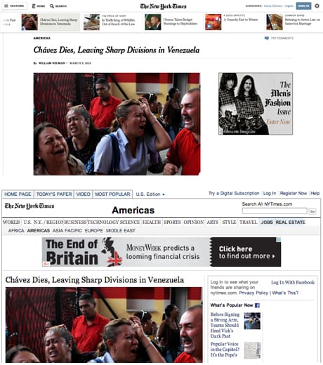
A close up comparison of an article, showing the ribbon on the new site (above) compared to the current menu bar
"You can 'page' through, either using the ribbon or with arrows that will move you through the entire collection," he said. "You could, for example, look through all the stories on the homepage by using the ribbon and paging device."
Section headers at the top of each page will be moved to a drop-down menu in the left-hand corner (see above) which users will eventually be able to customise, depending on what sections they read the most.
"It could be done automatically but with the potential to engage and edit," Adelman said. "Generically speaking we're interested in the kind of customisation that will either work passively on its own or encourage active engagement, but doesn't require it."
This personalisation feature will not launch with the rest of the redesign but will be introduced over time, in conjunction with the notifications and messaging feature, as the site "learns and gets smarter about the user".
"The whole thing is about the reader experience and being more helpful to the reader," Warren said. "One of the biggest problems we have is there is so much information online and often discoverability is the challenge.
"Some of the things Ian described, the ribbon and other things in the future, are really designed to ensure that readers can find what it is they're looking for that is relevant and of interest to them with the least amount of friction."