This article was migrated from an old version of our website in 2025. As a result, it might have some low-quality images or non-functioning links - if there's any issues you'd like to see fixed, get in touch with us at info@journalism.co.uk.
The Wall Street Journal today launched one of the biggest digital projects to come out of the outlet's London branch – an 'advent calendar-style' interactive of 100 legacies from the First World War , told through text, video and other digital media.
Journal reporters around the world collaborated on the project, which appears in front of The WSJ paywall and features well-known 'legacies' from the Great War, such as armaments and trench warfare, alongside more surprising ones, such as contraception and cartoons.

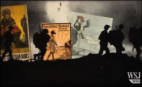
The legacy of cartoons from WWI from WSJ.com – click image to view video
The different legacies are displayed in a grid format, with tiles that can be re-ordered alphabetically or by topic, as well as by 'highest rated'.
By collaborating with its reporters and editors around the world, the Journal aims to show a perspective on WWI legacies that spreads much wider than the UK.
"[Initially] this was just coming out of the London office," explained John Crowley, digital editor EMEA, at The WSJ. "What really transformed this project was when we took it global.
Drawing on The Journal's resource of around 1,900 reporters and editors around the world, Crowley's team asked what impacts or legacies the Great War had left in their countries and were, as he says, "a little bit overwhelmed by the response".
For example, there is a tile dedicated to baumkuchen , a traditional German cake which became hugely popular in Japan after being introduced by a prisoner of war.
The Australian game Two-Up , which involves tossing a coin and betting on the result, also gets a mention. Popular with WWI soldiers, the game is now played on Anzac Day, the antipodean day of remembrance, to honour the fallen.
Speaking to Journalism.co.uk, Crowley and Elliot Bentley, one of The Journal's graphics editors, described some of the challenges and lessons learned producing the project.
Global collaboration
The ability to collaborate with Journal reporters around the world was "both a boon and a challenge," said Crowley.
The project was produced by a core team of 10 digital staff from The WSJ's London office, plus a couple of editors in New York.
However, Crowley estimated around 100 people have been involved in the project in total, including editors, graphics editors, video producers and coders.
People from Australia to Finland, from Russia to California, have all worked on this - John Crowley, The Wall Street Journal
"People from Australia to Finland, from Russia to California, have all worked on this," he said.
"We had to communicate with them over email and over long distances, and that's been one of the big challenges for us in terms of editing and going back and forth."
To enable collaboration on such a large scale, shared documents on Google Drive became central in co-ordinating the team's work.
With each legacy needing to have content submitted, edited and packaged with multimedia, rows and updates in a shared spreadsheet were colour-coded and organised by category and topic so the entire team could see what stage the production had reached.
'Atomised' content
Bentley explained the team chose to display content on cards because it "atomises the content", making it easier for readers to pick out the information which is most relevant and interesting to them.
"If we were presenting this in a long-form style I imagine there would a lot of stuff at the bottom that would be completely missed," he said but with cards the reader "can really slice through it" and cut to the most interesting elements.
Crowley added that the cards format allows people to "dip in and dip out" of the content, as they are unlikely to read all 100 cards in one sitting. Instead, cards that have been read already are greyed out to be quickly identified.
Within the cards, content is designed to provide essential information on each subject in just 300-350 words of text plus an image, video or interactive graphic.
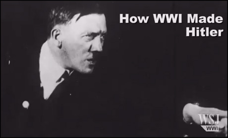
"We're not trying to write the definitive piece on Hitler [for example]," said Crowley, "but what we've done here is we've spoken to Sir Ian Kershaw who's the definitive guy on him, and particularly with the big subjects we wanted to do something special with multimedia content as well."
The cards format is proving increasingly popular for explainer pieces because, as digital strategist Amy Webb recently noted, it allows readers to get "
[very smart, very fast, and get the information that [they] need](/news/four-trends-for-the-future-of-digital-news/s2/a557064)
".

'How WWI made Hitler' on WSJ.com – click image to view video
Design
It was a key requirement for the project to be responsive, said Bentley. This meant that some of the Journal's existing online templates, such as the slider feature in the 'code breaking' card , had to be re-written from scratch.
The design format was created using a JavaScript library called Isotope, which Bentley noted had allowed them to produce some "interesting grids [to display the cards] that wouldn't be possible with standard CSS" as well as the 'sweeping' animations when the tiles are re-ordered.
However, while Bentley notes that HTML-based Javascript apps are "lovely to experience" with quick page-load times, he added that they were "terrible for for SEO" (search engine optimisation).
"It actually took a surprising amount of work to make to make sure that [we] had a nice clean URL, that it was scrapeable by Google, that it returned the correct metadata when you share it on Twitter or Facebook," he said.
And while the design of the interactive is a first for the Journal, it is one which can now be recycled by the outlet for different uses in future.
"Our plan is to hollow it out, essentially... and start turning it into a much more flexible template," said Bentley.
Engagement and shareability
By default, the tiles are sorted by rating, with each card offering users the option to vote items up using the "a significant legacy" button.
Another function which serves to involve the audience is the ability for people to submit their own legacies via a Google form under the 'what's missing?' tab, and Crowley explained that these suggestions can also be incorporated into the grid.
Rather than positing the interactive as a definitive list, Crowley says the Journal is "making a virtue" out of the fact the team may have missed something which readers may hold dear.
There is also a quiz where people can test their knowledge of WWI and share the results. As well as offering readers a bit of a challenge, quizzes serve to boost engagement and sharing because, as BuzzFeed's Jonathan Perelman has noted, users are drawn to content which reveals something about themselves .
Around half of the tiles contain videos or interactives. Some have been produced by the Journal, while other feature archive footage re-edited into short clips or loops in the style of Vine or Instagram.
Bentley added this feature had also been inspired by Facebook's recent app re-design, where auto-playing videos are silent until users press play, a feature he particularly likes because, "it's illustration rather than something you have to concentrate on" while still being "engaging and dynamic".
By providing a global perspective on the impact of the First World War and providing content which focuses on some of the lighter, or more cultural, legacies alongside heavier topics, the idea is that the project will have a universal appeal.
Despite the destruction of WWI, Crowley notes that "there was a burst of innovation and culture and colour which came out of [it] as well, like art movements [and] women's right to vote."
"You can say WW1 fired the starting gun on mechanised slaughter," he added, "but there was a huge amount of positive things that came out of it too."

